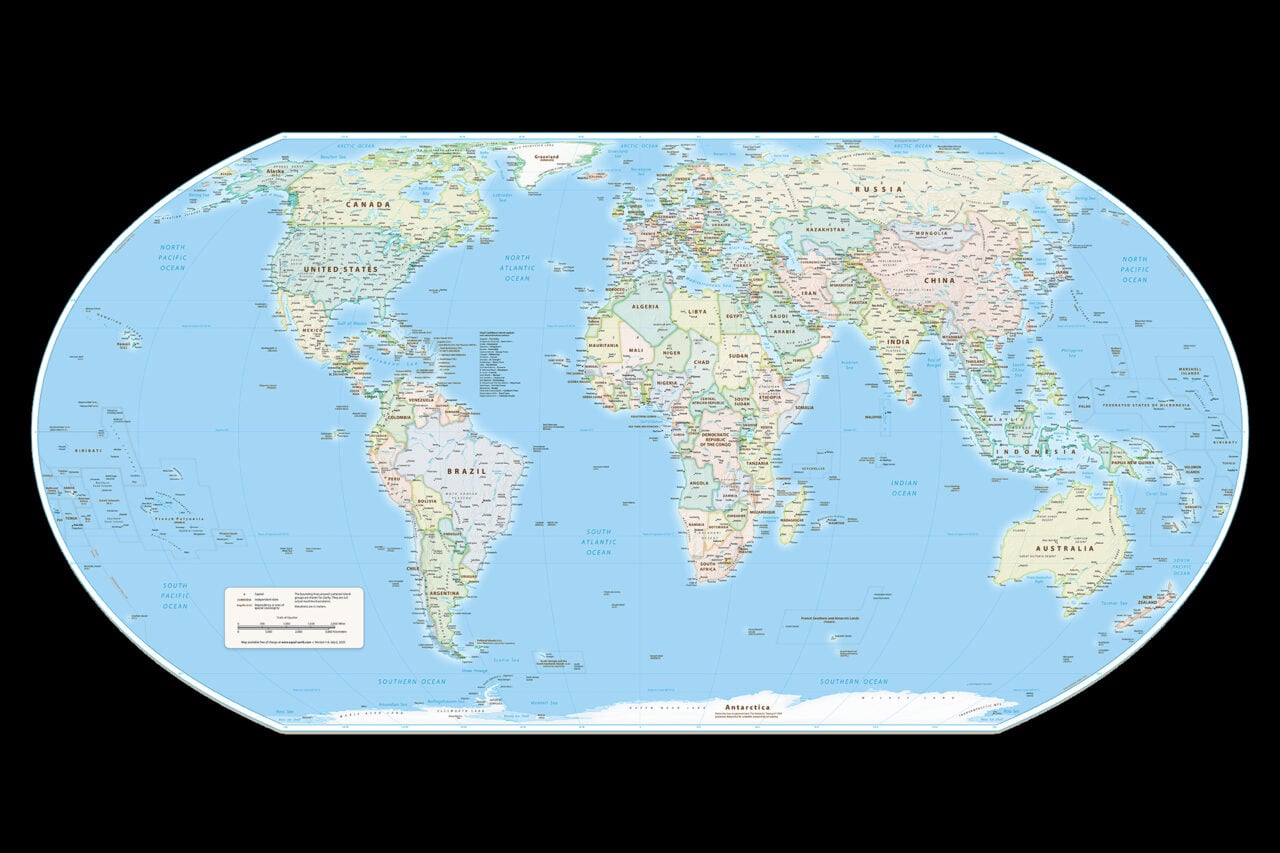
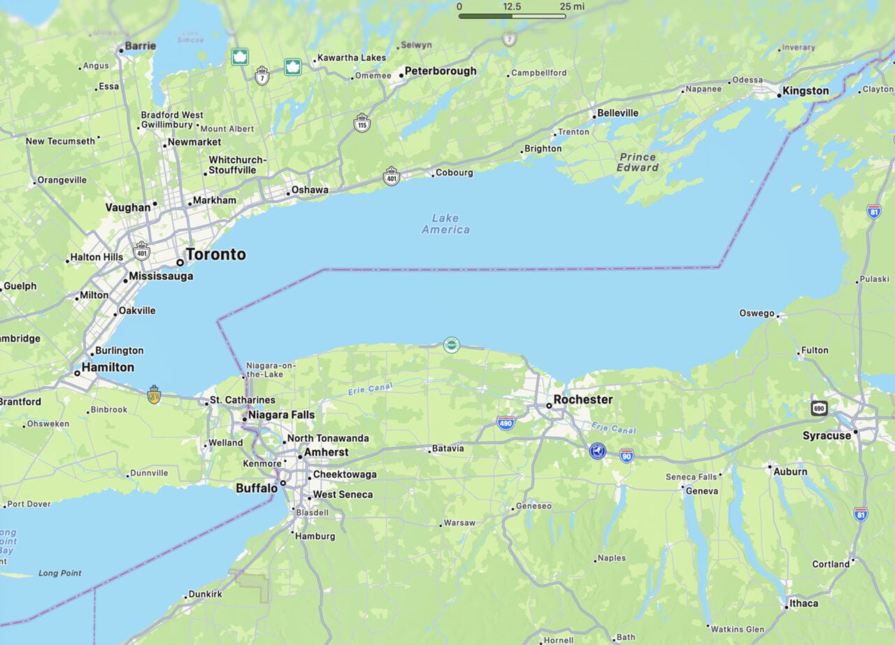
OpenStreetMap has been diving deep into its historical data recently, but this visualization is particularly amazing: it shows the work of all the individual users who studiously update the mapping service. OpenStreetMap explains:
https://gizmodo.com/every-openstreetmap-edit-ever-made-visualized-512560471
Here is a visualization of this amazing social fabric of individuals working together. We generated a color for each road segment from the user ID of the mapper who last edited it to show how many individual contributions large and small add up to a collaborative map of the world. Take a look at how many people have been mapping near you.
So, that means that areas that look like a complete mess were updated by hundreds of users while areas that resemble solid blocks of color were updated by a single user. Now, take a look at the map and realize just how much was done by so few. It’s amazing. But don’t take my word for it: go check out the full interactive version over at OpenStreetMap. [OpenStreetMap via Flowing Data]