Looks like Libra’s terrible, horrible, no good, very bad week isn’t over yet. In addition to major backers like PayPal, eBay, Stripe, Visa, and Mastercard dropping support for Facebook’s cryptocurrency project, now its logo has become the center of a legal battle over alleged trademark infringement.
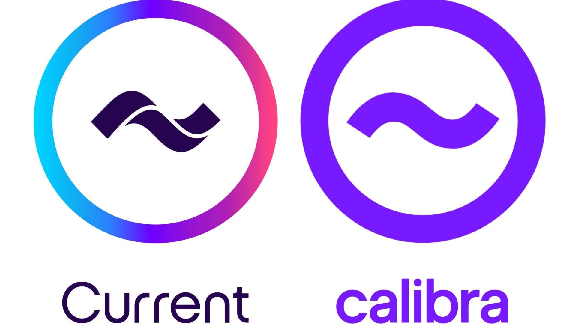
The logo for Calibra, a subsidiary Facebook formed to oversee the digital currency and its planned 2020 launch, bears a resemblance to one the mobile banking app Current has been using since 2016, a fact the company pointed out shortly after Libra’s announcement in June.
“This is a funny way to try and create trust in a new global financial system – by ripping off another fintech firm,” Current’s CEO Stuart Sopp told CNBC at the time.
this is what happens when you only have 1 crayon left pic.twitter.com/2JY5JfesQD
— Current (@current) June 19, 2019
So much of a resemblance, in fact, that the company filed a lawsuit against Facebook on Thursday arguing that Calibra’s logo “is not only confusingly similar to, but virtually identical to the Current Marks.”
And it’s true, Calibra’s logo looks like the corporate brand equivalent of copying another company’s homework. Probably because, well, that’s essentially what happened: Both logos were purportedly created by the same designer, a San Francisco branding firm called Character, according to CNBC. Character is also named as a defendant in the suit. The firm did not immediately respond to Gizmodo’s request for comment.
Given that the two were likely designed three years apart, there’s a chance that each logo came from completely different teams at the design firm. After all, a squiggly line in a circle isn’t exactly ground-breaking design. But for both to be created for digital finance ventures and share the same color palette to boot? That’s shady as hell.
This lawsuit is just the latest blow to Facebook’s cryptocurrency venture before it’s even gotten off the ground. Libra has prompted international scrutiny from banking and antitrust officials, with recent reports that the DOJ and the FTC have opened antitrust investigations into the tech giant only fueling these suspicions. Likely looking to avoid similar inquiries, five of the 28 founding corporate supporters planned to run Libra’s regulatory body have hightailed it from the project in the last week.
Gizmodo has reached out to Current and Facebook and will update this article with their responses.