
Whether we realize it or not, the fonts we interact with on a daily basis can be wildly impactful in some pretty surprising ways. These everyday fonts blend in so seamlessly with the world around us, though, that we hardly even notice them. So instead, what would happen if we tried blending our world into the fonts themselves?
Apparently, you’d get the off-the-wall, mouth-watering, poignant, and soul-suckingly creepy creations you see below. Because while the usual method of using abstract designs for fonts make sense, forcing everyday objects into the strict, uniform dimensions of the alphabet is completely bonkers in all the right ways.
Grillography
Created by Oslo-based design agency Anti, Grillography uses meat, fish, and vegetables to form a grilled, hand-arranged (no photoshop here), and totally edible typeface.
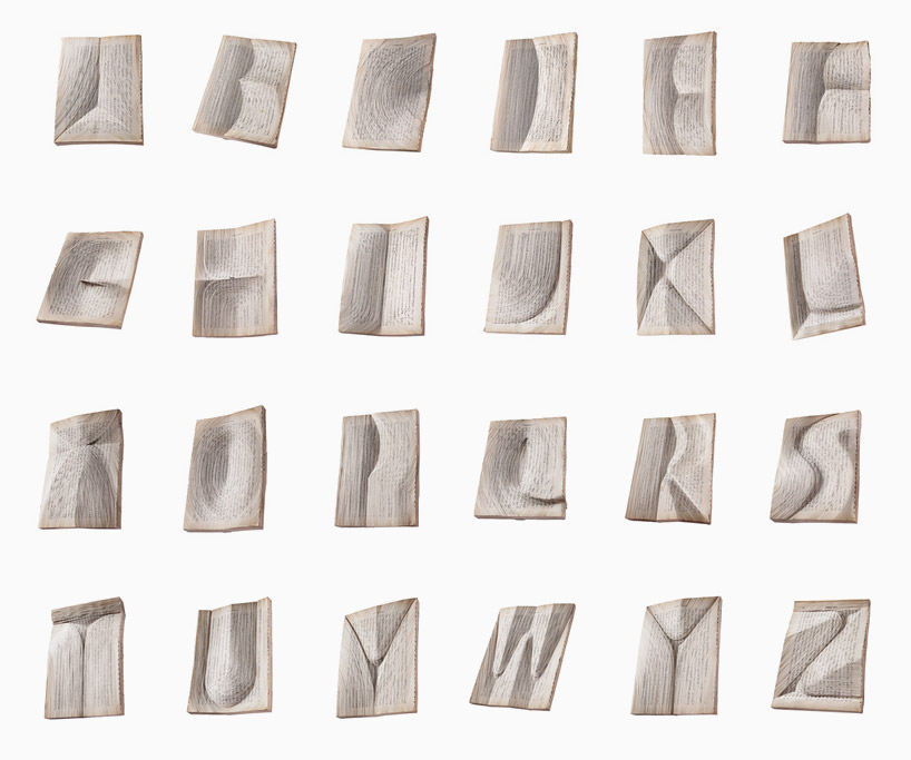
Oratorical Type
Though Oratorical Type might be one of the simpler designs as far as pure aesthetics are concerned, it’s undoubtedly one of the most intricate. Each upper letter is composed of intricately shaved, overlapping bits of paper stacked to take on the form of the letter it represents. The closer you get, the more it becomes apparent that each symbol is made up of hundreds of thousands of smaller ones just like it.
Fold Yard
Cubicles’ bad rap is, for the most part, well-deserved. Which is why Fold Yard by Benoit Challand, a typeface made entirely out of modular desk pieces, appears extra whimsical by comparison. Each desk still has its main storage spaces, partitions, and shelf space, all while fulfilling your typographical needs.
Blossom Type
Blossom Type is a far more dainty typeface than any of the others thus far. Designed by digital art director Alice Mourou, each bud, leaf, and petal has been meticulously arranged to appear as though the vine just happened to grow into that shape of its own volition. But even when you know the truth, it’s still just as beautiful to behold.
Hair Alphabet
Some artists require a bit of growth before they can start to hit their stride. New York design student, Shurong Diao, takes that growth especially literally. Hair Alphabet is exactly what it sounds like: An alphabet, made from hair.
The Sculpted Alphabet
German design studio FOREAL wanted to sink their teeth into an extracurricular project apart from their more typical advertising fare. The result? The delightfully creepy, CGI-powered letterings that make up The Sculpted Alphabet. Covered in skin, wax, hair, goop, and everything in between, the typeface exists in a world halfway “between photorealism and surrealism.”
Cable Thief
Cable Thief, which comes from the minds at British design studio Studio Disjointed, takes its cues from the UK rail network’s iconic overhead power cables. More than just aesthetics, though, the font is mean to call attention to the rampant cable theft problem that affects so many commuters on a daily basis. Each letter’s disjointed silhouette is only able to remain sturdy thanks to the cables and pulleys that keep it from falling apart.
4D Type
This lettering built from bubble wrap is actually based on Barcelona graphic design studio Lo Siento’s award-winning 4D Type, which is composed of six-sided letters that can be read from any conceivable angle. Here, each bubble was injected with cyan-colored water from a hypodermic needle. An oddly clinical and scientific beginning for such whimsical results.
Eggs Font
Eggs can be a tricky bit of breakfast business—and that’s just when you’re shooting for something vaguely approximating a circle. Despite all odds, Estonia-based studio Handmade Font managed to create Eggs Font, a typeface made entirely from actual eggs they cooked themselves. And all it took was 1,000 eggs, 10 pans, a bottle of oil, a few burned fingers, and an ungodly amount of patience.


