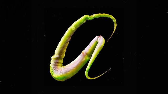
This alphabet—by Boston-based graphic designer Ari Weinkle—is quite unique. First because its texture feels realistic, organic, and alive. And second because its creepy moves: The letters twist and turn as if they were actual animal appendages.
In my work, I look to break apart and re-appropriate different forms such as the human figure, geometric and organic shapes, and typography. Through the process of fragmenting different entities, I am continually searching for new and unique juxtapositions between shapes, colors, and patterns.
Ari Weinkle is a Boston-based graphic designer. His inspiration comes from a wide range of sources; Japanese aesthetics, Native American iconography, semiotics, abstract expressionism, surrealism, and philosophy.
You can follow Ari’s work on Behance, Twitter and his personal website.
This is part of a series in which we are featuring really cool 2D or 3D illustrations and animations. If you are an illustrator or animator with high quality work, please drop me a line here.