Nokia is in trouble. In the US, the brand’s gone from ubiquitous to the stuff of tech nostalgia. Its next (last?) stab at American relevance? The N8. We pitted the N8’s usability against two rivals, and the results aren’t pretty.
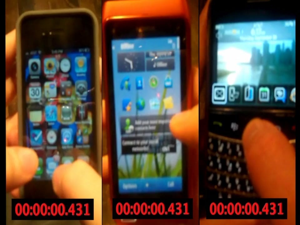
To conduct our highly-nonscientific exercise in interface usability, we recruited two savvy smartphoners from around the Gizmodo office to go head to head (to head) with the N8. After familiarizing myself with the N8 for an ample amount of time, our trio competed in three simple smartphone tasks—sending the same email, mapping directions to the same place, and taking a photo of the same object—we wanted to see which device is the king of usability mountain. Spoiler alert: not Nokia’s. The hardware itself is decent, but in terms of interface design—whoo boy. Again, keep in mind that this is by no means an objective benchmark or actual review—but Nokia has clearly dug itself into a design hole, and it’s a problem made flagrant with some context.
But we’ll let the battle footage speak for itself.
An extra gigantic thank you goes out to Gawker TV’s Sarah Natochenny for help with the video


