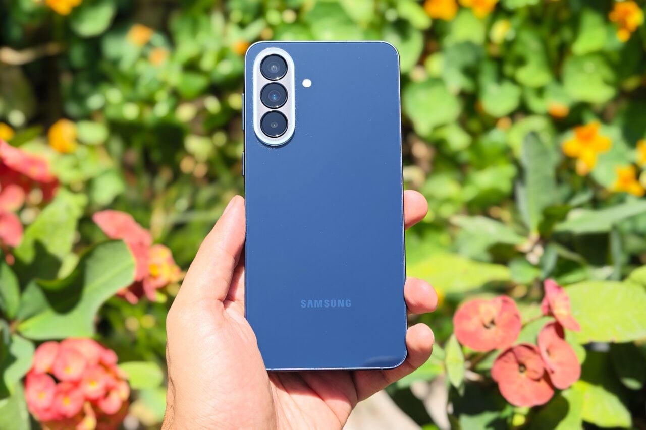
This week, we finally got our first hands-on look at the long-promised “Ocean Depths” color scheme of the Essential phone. Despite looking very much green in promotional photos, however, the device now appears quite blue. So which is it? And why has this question driven me to the brink of madness?
When the creator of Android first announced the Essential Phone—long before the reviews landed, before we heard about the camera troubles, the price cuts, and modest sales—Essential teased a device in four colors, some perfectly plain (white, black, gray, whatever) and one spectacularly unique: Ocean Depths. And goddamn! What a unusual look.
Minimalist with no flashy logos and a drippy, raindrop-ish notch, Essential’s phone looked good. Especially the green. It held fast in my mind even after I bought a new iPhone. Like an old Jaguar in British racing green. Like palm leaves set before a gold sunrise. Like the first microphone I’ve ever owned or an old emerald ring.
The green phone was announced, but it was perpetually “available soon.” I checked the site every few weeks for an update. I brought it up numerous times in the office. Everyone I talked with seemed to agree with me.
Then this Tuesday, Essential finally dropped a new teaser ad. “A new wave.” I see gold, I see… blue. I guess there’s some green in there? Something new is coming. We wait.
A new wave is coming. #EssentialPhone pic.twitter.com/YPFgzusFhb
— Essential (@essential) February 13, 2018
Two days later, Essential shared more, announcing the limited availability of its “most fashion-forward design yet.” An additional color, one also named “Ocean Depths?” Or is that the same phone?
Ocean Depths: style as unique as you. This #EssentialPhone is our most fashion-forward design yet, featuring a vibrant teal ceramic back and copper frame that will make waves among a sea of lookalike devices. Ocean Depths will be available in limited quantity today at 12pm PT. pic.twitter.com/8GRcA8bM3Y
— Essential (@essential) February 15, 2018
We need a closer look. Described by Essential as “vibrant teal” with a “copper frame,” did the phone always look this way? Did it change?
Have I changed?
Perhaps Essential was inspired by shallower depths of the sea than my eyes first led me to believe. I suppose it mostly looks the same. Sort of. I’m not convinced. If only I could hold it in my hand.
Unboxed Therapy’s Lewis Hilsenteger did. In a video uploaded yesterday, he described it variously as “turquoise,” “kind of a luxurious color,” and “slightly more matte and less reflective.” And, as shot by Hilsenteger, it looks bluer than ever.
I honestly cannot say if the ceramic back of this phone merely swings dramatically across the color spectrum depending on the lighting. It looks, good, fine, but are my eyes playing tricks on me? “Rose gold” and “space gray” can rot in Cupertino, but where is the real “Ocean Depths.” What is teal supposed to look like anyways?
The Oxford Dictionary defines teal as “a dark greenish-blue colour.” The HTML 4.01 specification describes teal as 50 percent green and 50 percent blue, or “#008080.” To be fair, we’re constrained to a handful of images and one video. Perhaps I’m delusional or mildly blue-green colorblind. Or maybe, as the infamous Dress once demonstrated, perception is squarely in the mind of the beholder.
But these colors—I have no idea what’s going on anymore.
Essential.
What color is your phone?


