My boyfriend and I had some free time and the weather has been pretty mild for this time of year in Pennsylvania. We went to a park not very far from our apartment and many of them still have evidence of the record setting rain fall from summer. I saw this bench in the water and thought it made a good photo. Just as I started shooting the two men in a boat came into view.
I wasn’t really impressed with the original colors but thought of this challenge as I often check each week and want to participate but lack confidence and time.
The painting used was
Van Gogh’s “The Sower” for no other reason than I really loved the colors.
Original is located here.
Shot on my Canon T3i with kit lens.
-Patricia Boyce
Coast jogging
I captured a man doing his jogging along the coast on a freezing Sunday midday.
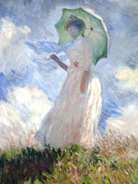
The photo was interesting but lacking colors due to haze. After trying multiple work of art on Photoshop, I came up using Monet’s woman with parisol from the musee d’orsay. The match color parameters were luminance 100 and color intensity 100, and a distracting flying bird was removed from the sky. Much better result!
Canon 550D
EF-S 55-250mm IS
79mm
1/500 s
f/9
ISO-100
– Filipe Soares
Canon EOS 5D Mark II, f/2.8, 1/80 sec., ISO-100, 85mm f/1.2L II USM Lens, 3 external Speedlites powered by PocketWizards.
Among my favorite still life painters is Paul Cezanne. I decided to use this contest as an opportunity to recreate his “Plate and Fruit” painting. Unfortunately, after the many hours of picking the the right fruit, finding a table, and trying to match the lighting as close to the painting as possible, the photograph itself came out bland and uninteresting. So I layer masked every piece of fruit and colored them individually and decided to use the Mixer Brush Tool on Photoshop which I think adds depth to the photo.
-Daniel Jang
I spent the entire day on Sunday shooting in and around Rockport MA, not even thinking about the Challenge until I got home late that evening. I started looking at the day’s shots to find a good candidate and finally settled on this picture. It was taken in Gloucester on Nautilus road by Good Harbor Beach, looking toward the ocean. The tide was low, leaving a nice “stream” meandering along the beach. Not sure whose house that is but I totally want it 🙂
I tried color matching with several famous paintings and the best result was with this picture of Van Gogh’s “Field of Wheat with Cypresses”. I love the fact that the compositions are somewhat similar as well.
Nikon D7000
AF-S DX Nikkor 18-105mm f3.5-5.6G ED VR @ 40mm
f/8, ISO 400
HDR from 3 handheld RAW exposures (1/500s, 1/250s, 1/125s) using Photomatix
Color matching in Photoshop CS4
– Frank Poulin
I call this shot, Autumn Grapeleaf.
My father came down to California, from Idaho, to visit. Since we both contribute to these photo challenges I took him out on Friday to an area of Northern Cali bursting with acre after acre of Vineyards dressed in their fall best. Wish I could show everyone how pretty they looked. I had a blast shooting all day, from sun up to sun down, all manner of things with my dad. His GPS even took us on some back roads that I don’t think anyone knows exist. We laughed so hard when after nearly thirty minutes of silence on a windy canyon road, she suddenly chirped to life, *BING* “Prepare to continue straight on Bumfuk Canyon Rd.”
This grapeleaf was shot at a vineyard in Plymouth California, called DeYoung Winery. It is a beautiful place situated along a curve in the road. The original photo is here.
I matched the colors to a painting of Monet’s Garden, in France, by L. Diane Johnson, called Dawn’s Delight.
Some minor adjustments made with the sliders on the color matching window is all I did to get the teals and blues out of the leaf. I toned down the oranges since the painting doesn’t have any.
Canon EOS Rebel T3i, EFS18 – 55mm f/ 3.5 lens @ 55mm, f/5.6, Shutter speed 1/320, ISO 100, polarizing filter, no flash.
-R.J. Barrett
Attached is my submission for the Color Match Shooting Challenge, and in fact, my first ever submission for the Gizmodo Shooting Challenge. I’m a college student at Drexel University, Philadelphia, and recently purchased a T3i 18-55mm f/3.5-5.6 kit, and was trying it out around campus when I noticed that Drexel Pizza decorated the trees in front of their restaurant with holiday lights. I wanted to take a festive looking picture that still shows how dark and gloomy winter in the northeast can be. Using my camera and a tripod for a clear image, I took a picture focused on the street sign with the widest aperture I could. I then brought the picture to my girlfriend Jacqui Oschell, who is an Art Education/Art History major/minor, and we looked through her art history textbooks for some cool pieces to play with. The choice was difficult to make once it was narrowed down to two, but my favorite color scheme was stolen from Paul Gauguin’s piece named “Where Do We Come From? What Are We? Where Are We Going?”
Camera: Canon T3i/600D
Lens: Kit Canon EF-S 18-55mm f/3.5-5.6 IS Type II Lens
Settings: f/3.5, 0.5″, ISO 200, Tungsten White Balance
Regards,
-Michael Dornisch
After my original idea for this challenge flopped at the last hour, I decided to be more effective (read: lazy) and shoot a still life. I picked some random flowers at the supermarket (read: the cheapest ones) and surprisingly, what I picked happened to be Vincent Van Gogh’s motif in 1886’s Vase with Red and White Carnations on a Yellow Background. Because of the crazy coincidence, I decided to go literal and re-do the painting in a photo.
As I started working with the flowers and the “match colors” adjustment in photoshop, I realized a plain solid background would not work out, so I ended up painting my paper backdrop with a brush to resemble the background from the original painting.
Canon T2i, 10mm, f/4, ISO 1600 (w/flash)
The link to the painting is here
-Diego Jimenez
Les Amonts of Light
For this weeks shooting challenge I tried to take photos of the plane and mundane to let the match color technique make them beautiful. I tried various different exposer levels on various different subjects until I came up with this which I believe turned out the best. I used Les Amonts by Rene Magritte for the color pallet.
Canon 60d. Modded Nikon 28mm f2.8 Macro, F2.8 ISO 400, 60/s.
– Tyler Bedgood
For this contest, I first Googled random images of “famous paintings”. I scoured pages and pages of paintings and came across some boats. One of them reminded me of the one in the Inner Harbor that I walked past on a semi regular basis when I used to work downtown. This boat, the USS Constellation featured in the photograph was constructed in 1853. I like the juxtaposition of a ship from 1853 against a modern day skyline. I color matched the picture to a painting of Napoleon I.
An original of my picture can be seen here. A comparison of the original work of art and final product can be seen here.
-Peter Mares
For this color theft challenge, I knew immediately that I wanted to use Vincent van Gogh’s “Wheat Field with Crows” (a favorite of my son).
I own a retail store and it has been SO busy. I could not even get around to taking a picture until this morning – and it was pouring. (Our drought-ridden area is very happy.) I had to snap this fast, in the rain, on the way to the studio. It was not a great quality picture. However, it seemed appropriate to use a brush filter on the image, do the color match, and voilà!
Thanks!
f/2.8
1/250 sec
ISO 80
-Karen Tarlow
This is the first time i participate in the shooting challenge, actually shooting challenge is the reason now i like photography, well for this shot i walked all around the downtown looking for the most colorful place i could find, then i remembered this place called “Barrio de los sapos” in Mexico, which is some kind of flea market where all the buildings are painted different color, the sun was exactly in front of me so i took this picture in 5 exposures from 1/1200 to 1/100 and then made an HDR version with Photoshop so it wasn’t just shadows, i wanted the final result to look like a watercolor painting so i tried with several watercolor paintings but the result was usually the same colors of the original picture but pale, then i found this painting called Madame Renoir i found in an art book i had from the high school, it wasn’t a watercolor painting but i matched the colors the result was what i was looking for, all the buildings started to look like watercolor paintings and the flare over the little plant on the right side reminded me a lot of my mother’s kitchen in my childhood, so i decided this is the picture i had to entry to my first photo contest at Gizmodo
-Pancho Mejia
Whitehawks
I couldn’t think of anything to do for this challenge until I was sitting in White Rose with my boss trying to explain what the challenge was. I said to him. “It would be like if I took a photo of this place and then used the colors from that famous diner painting to make the two look similar.” I decided my quick example was probably not a bad idea so I figured I’d give it a try. The results didn’t come out exactly as I had hoped, but I do like it. I used a Nikon D90 set up on a tripod for 1.6 sec at f/8 ISO 100. I cropped the photo to make it more similar to Nighthawks.
-Tom Andersen Jr.
Original Colours/Work of art from Walcoo Market Day
Photo Taken on my Pentax K200D SLR, fitted with Sigma 18-50mm f1:3.5-5.6 short Zoom lens.
Shot taken with the following settings. ISO-200 f/8 1/90 sec, focal length 30mm
I tried to replicate Walcoo’s theme at our local shopping mall. A local café had chairs that I hoped to be full and provide some foreground interest. However the day was really hot and people were hiding in the shade and coolness, not out in the open.
I had to move my location, which lost the effect that I was looking for. However the snake handlers were drawing a crowd which was an alternative.
Post processing done in GIMP 2.6. I found a method to copy the colour palette and then apply it to my original picture. This seemed to work well with a loss of resolution.
I used the Oilify Filter with Mask Setting of 13 to blend the colours a bit and then applied the Canvas filter (depth 8) to give it a more painting feel.
Not my best efforts as I am not entirely happy with the subject but I am submitting anyway.
-Nick Smith
This was a fun challenge because I had no idea how cool this feature could be. I knew right away that I wanted a seaside picture as many of my favorite works of art are water related. I wanted something that would highlight the blues and greens that I love in Monet’s waterlilies; not an easy task for December in New England. I caught this couple that seemed to be walking out of the ocean and was able to grab the green grass in the foreground. Canon 7D with 24-100 mm lens for 1/100 s f/18.0 at ISO 100
-Brian Jones
An image of quaint old townhouses in the winter twilight have been transformed with a pinkish color scheme … The original image is here.
and the match image is here: Degas – Dancers in Pink
Taken with my Canon 60D at twilight in Old Town Alexandria, VA….ISO 800, 100 mm, f/5.6
-Cheryl MacLean
My original (HDR) photo can be found here
I used the painting from the Starry Night by Vincent van Gogh
Match settings:
Luminance: 50
Color intensity: 50
Fade: 5
Photo taken with:
Canon EOS 1100D + Sigma 18-200mm OS
ISO 1600, 1/40, F5.6@96mm
About the picture:
I walked along with some friends nearby the Stephansdom in Vienna, on our way we heard someone playing cello.
We stopped by and watched him passionately playing on his cello. His energetic play crowded a lot of people around himself.
Everybody just stood there, the elderly people were sitting nearby on benches and listened to him, while drinking “Glühwein”.
It made my day.
Best regards:
-István Pajor
I took a photo of a field of grass with irrigation equipment in the distance. The blue in Bosch’s 500 year old painting The Garden of Earthly Delights is vivid, and the result looks like a causeway across a lake. I matched using a part of the pond in the left triptych. I like how color changes perception so dramatically.
Panasonic G3 with the 45-200mm lens at 200mm. f/5.6, 1/400 sec, ISO 1600. I used CS 4’s match feature.
The painting is here
The original (cropped) photo is here
– David Lee
here is my match submission.
I used my Canon 5d Mark 2
24-105 L series lens – set at 24mm
I decided to take a photo of evil krusty in a cemetery. And I matched it to Starry Night, figure it could work good because there are similar objects, like the sky (duh), the ground, and the tombstones which are matched to houses.
enjoy
thanks
-Willie Marlet
The photo was taken with an Olympus E500 with a 14-42mm lens set at 35mm with an aperture of f/5.6 for 1/50th of a second. The ISO was at 100. Was out walking the dog as normal, the moon has been rising really early recently (this was taken around sunset, approx. 16.00) and was framed nicely by the trees. I’m warming up to take a picture everyday for 2012 so I’ve been more conscious of photo opportunities! For the match, I thought the moon would look interesting if it was a vivid red so I went looking for paintings of fires, found this and ran with it. My original picture is here.
-Harry Guinness
Equipment:
Nikon D5100
18-55mm Lens
f8, 15″ exposure, ISO 800
It had just rained so I decided to take some shots down in the town center and started taking some pictures with the water reflection giving a really cool effect. The longer exposure time gave it a very bright look despite it being about 10pm at night.
I matched the colors from the painting “Sunday Afternoon…” by George Seurat.
-Stephen Wolking
I was taking a picture of the sky the other day because it just looked so nice and blue! I remembered the challenge and wondered what it would look like if it was really blue. So I took the photo and matched it to International Klein Blue by Yves Klein.
Taken on a Nikon D60, 35mm lens, f/9, 1/250, ISO 200.
– Emily Turner
The wife has entered the last few photo challenges and, this week, I wanted to play along too. Here’s a photo of my wife preparing another delicious meal (she was last week’s Turkish Delight) taken on my wife’s Canon T2i with colours stolen from Vermeer’s The Cook.
Pixelmator doesn’t have any magical steal the colors button so this took lots of painstaking magic wand selection and hue replacement. Took me forever!
Original photo and Vermeer’s The Cook on Flickr
– Kevin Lawrence
Camera & Picture info: Kodak Easyshare Z1012 IS ISO-800, f3.2, 1/640 sec. exposure.
Not too much to say about this shoot, I just went to my backyard shooting insects in plants, the interesting is that I used a magnifying glass in front of the camera because my lens aren’t good enough to macro photos.
To the effect, I picked my favorite art “Futebol” from Portinari and used Photoshop CS5 to match the images, I used 200 on luminance and 80 on color intensity and also ‘checked’ neutralize.
-Paulo Victor Rodrigues
So many paintings to choose from…that was the hardest thing for me in this challenge. Do I go with Robert Lenkewietz or Frida or Matisse?? In the end I went with none of those and chose Jose Guerrero who was a Spanish Artist born early last century and one who described his paintings as being based on vertical thrusts or horizontal tensions and diagonal criss-crossings. Just two basic colors with such contrasts. I think it makes for a good photo. Thanks for the challenge…
Here’s the original picture
-Georgina Lawrence
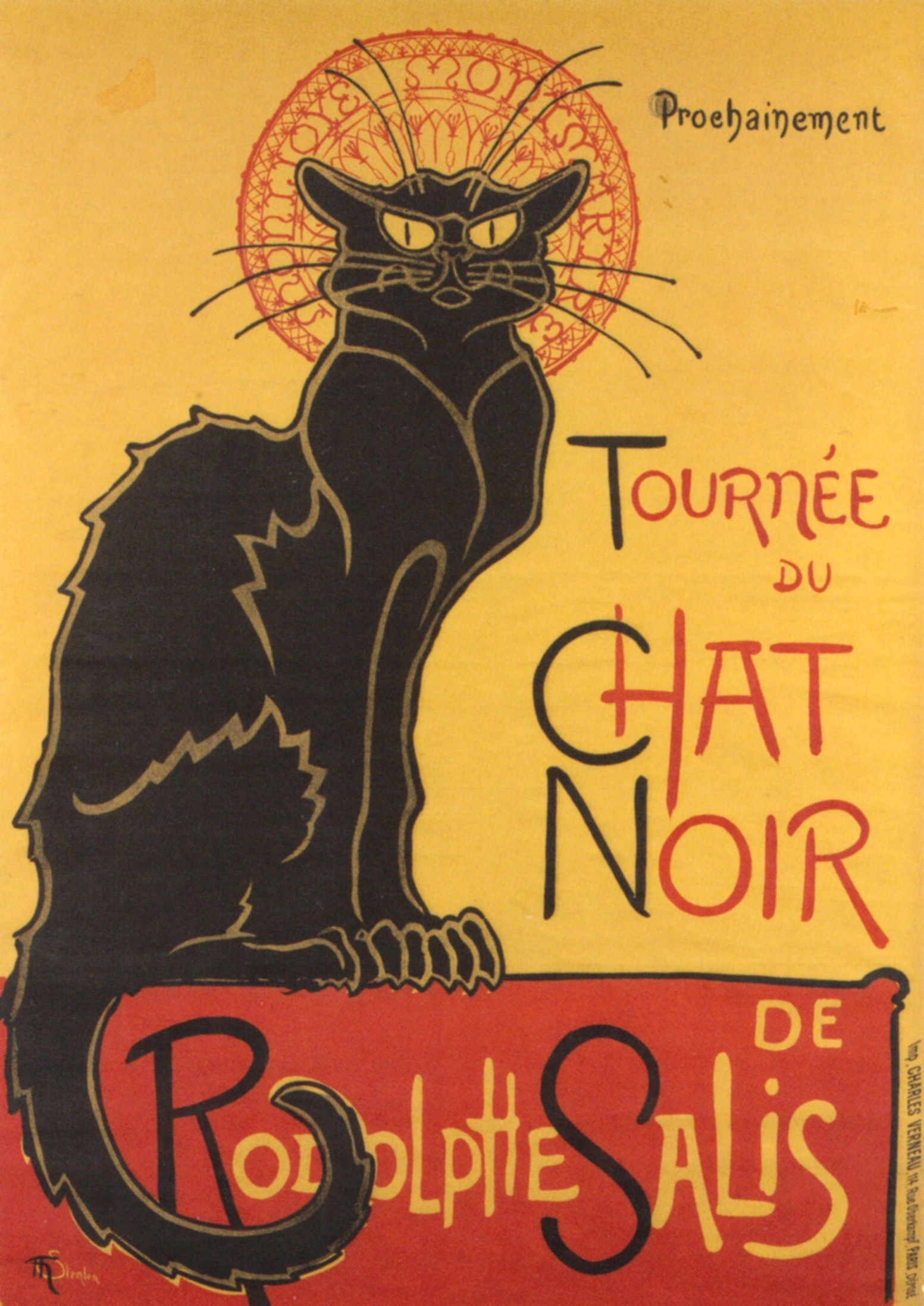
I bought the poster ‘Chat Noir’ by Steinlen at the Art Institute of Chicago during the Henri de Toulouse-Lautrec exhibit a few years ago and have always been a fan. When I saw this week’s contest I immediately thought to re-create the poster with my black cat (chat noir), Exley. My record player has a redish/merlot color lid to it and is in front of my window so the cloudy Chicago weather created the perfect back lighting and really made the red pop. The cat’s eyes probably show the biggest change from the original photo.
Shot with a Canon T2i
EF-S18-55mm f/3.5-5.6 IS kit lens
ISO 3200, f5.6, 1/60
Théophile Alexandre Steinlen’s work
-Rob Lennox
Match – Shooting Challenge Entry
Subject: 1914 Steam Paddle wheeler S.S. Sicamous
Worked on the Okanagan Lake from 1914 to 1936, in the south interior of British Columbia, Canada.
Ship has been berthed at Penticton, British Columbia in 1951, and now is used as a local history museum.
Equipment: Canon A1100 IS digital 12MP stock lens
Technique: Penticton gets a lot of sunshine, so usually this type of photo would be very bright with a bright blue sky. I wanted to create a photo that emphasizes the blue of the water and the blue of the sky, but still have the darkness of the clouds. Vemeer was my choice of artist for the use of blues/grays in the selected composition.
Painting for colors: “The Balance” by Johannes Vemeer, 1644
Story: Penticton is confined by two lakes (Skaha Lake at the south, and the Okanagan Lake to the north.) with over 6 miles of beaches, Penticton is a tourist destination for many people over the past decades. The S.S. Sicamous has been an attraction for over 60 years, and is a symbol of Penticton. I’ve always like the location where the ship is berthed, and countless tourists have photos of this ship in the albums. I hope the ship remains for many years to come.
– Robert Anderson
Hi,
first of all my compliments for your site! It’s amazing and full of interesting news.
I used an original photo of Sardinian sweets from Italy “matched” with the paint “The Church at Auvers 1890 – Vincent van Gogh”
Here is the link to the work of art I stole from.
Here is the link to my original photo.
SHOOTING SUMMARY:
Title: “Turn the lights on”
Lens: AF-S DX VR Zoom-Nikkor 18-105mm f/3.5-5.6G ED
Camera: NIKON D90
ISO: 640
Exposure: 1/40
Aperture: 5.3
Focal length: 80mm
Flash: no
Description: The subject of the original shot is a traditional handmade sweet from Sardinia (Italy) prepared by my mother-in-law for my wedding day
– Maurizio Gemelli
When in New York I had to take the traditional skyline picture. And I knew I wanted to match it up with a Van Gogh. I originally thought Starry Night, but then I saw Starry Night over the Rhone and the reflections on the water that were also in my picture. I knew I had to use that one to steal from. My original is pretty great, at least I think so, but I had no idea how awesome it would turn out. I only wish the picture were more blue and yellow instead of vibrant, but hey, it still is a great piece of art.
Canon 7D
28-135 mm lens
30 sec
ISO 100
– Nick Badger
Canon Rebel T3i
50mm f1.8
iso 800
Was at a company event shooting video and looked up and switched over to snag this cool looking light.
-Kevin Scott
When I read this week’s shooting challenge, my instant reaction was
that I wish we were doing this in the fall or spring because I could
imagine the beautiful colors that would result. Then I executed this
technique on one of my photos and it made perfect sense—bring
otherwise drab photos to life with the colors in a work of art. For
this photo, I thieved the colors from Georgia O’Keeffe’s “From the
Lake”.
It was shot with a Canon EOS Digital Rebel, EF-S 18-55mm lens, 1/100
exposure, f7.1.
-Jamie Babbitt


_-_Wheat_Field_with_Crows_(1890).jpg)