In New York City, genders are unevenly mixed. As men and women age, they pour into and out of neighborhoods, pooling, dispersing and redistributing across the five boroughs in a mesmerizing demographic dance that datavisualization expert John Nelson calls “gender flow.” In his latest visualization, he charts this dance by assigning a dot to every person in NYC. The resulting map paints a fascinating portrait of life and death in the Big Apple.
Top image by sprengben via flickr
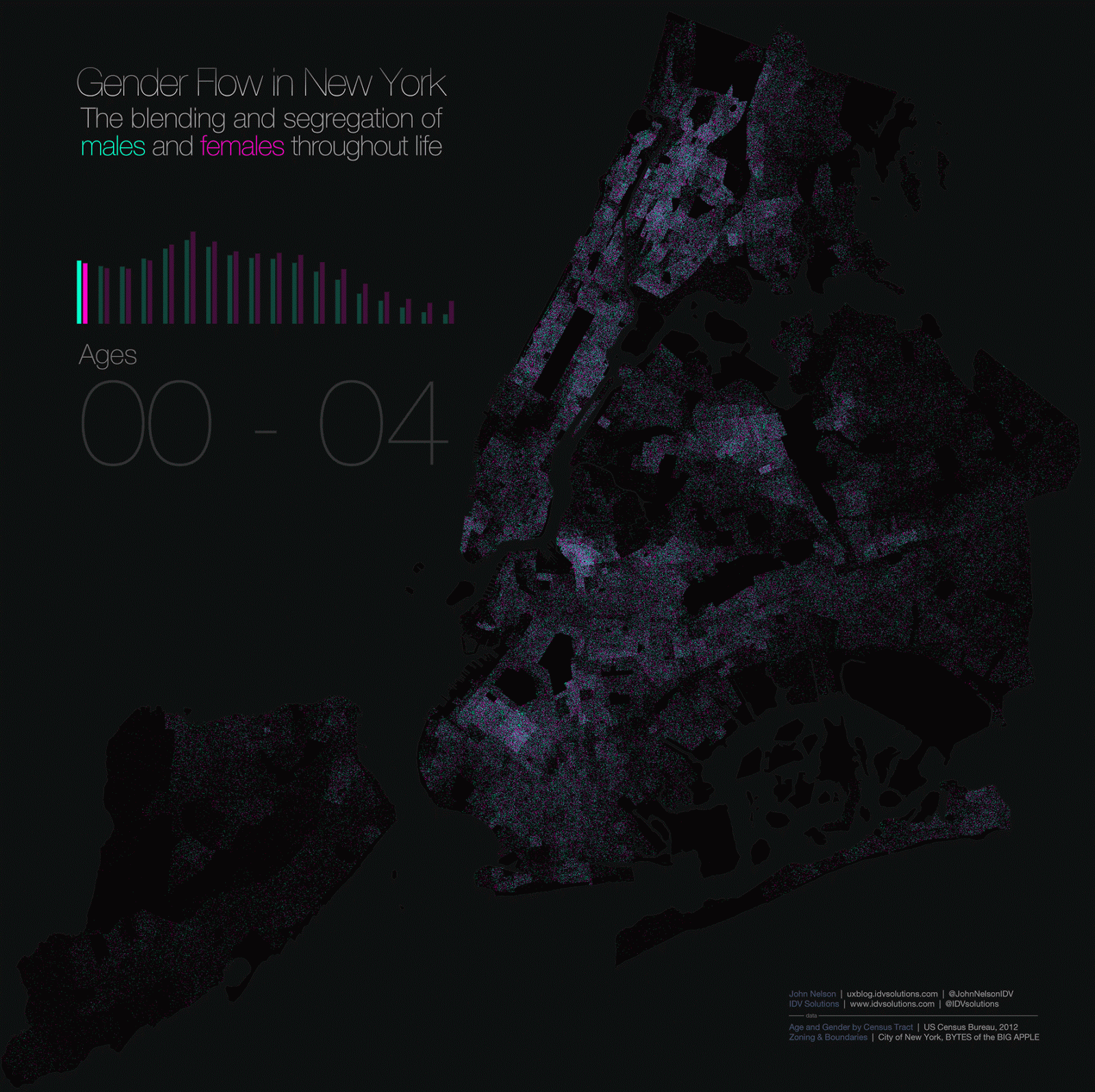
Males in Nelson’s dot map are designated by a pinpoint of blue-green, females by a speck of pink (based on tract-level population/gender counts from the US Census Bureau). Crucially, the dots are segmented throughout their ages. The result, Nelson tells io9 via email, is a visualization that tracks the gender dispersion of every person in New York City throughout his or her lifespan. [Click here for a much bigger version]
Between ages o and 14, the entire map is more or less an evenly mixed purple landscape; newborns, children and adolescents, after all, can’t really choose where they live – let alone where they’re born. But between the ages of 15 and 19, something interesting happens. As Nelson writes on his blog:
We are in the age-span where teens/young adults can choose where to live. And they choose paths that are not gender-neutral. Immediately we see clusters of females and, to a lesser extent, clusters of males. What’s the deal? College. And prisons.
Morningside Heights positively glows pink as the home of Barnard College, as do other institutions of learning sprinkled throughout Manhattan. The garment district is another draw.
We also start to see the filling of Rikers Island with green dots as young men begin to populate the jail complex.
Certainly a deviation in optimism between high-density young women neighborhoods and high-density young men neighborhoods.
The analysis for other age groups continues in greater detail over at Nelson’s blog. In their early twenties, for example, professional women tend to gather in Midtown Manhattan, while swaths of early-twenty-something masculinity emerge in places like the SUNY Maritime College, and Yeshiva University. The heterogeneity persists until around age thirty, when things start to blend again. “Not since infancy have the genders been so mingled,” Nelson notes.
The forties and fifties are characterized by a re-segregation of genders, and a thinning population. In their sixties, men disappear at a faster rate than women. The seventies and eighties see the emergence of retirement communities in Manhattan. “Two neighborhoods are holdouts for octogenarian men,” observes Nelson. “They make a final stand in Brighton Beach and Turtle Bay.” He continues:
At 85 and older, New York is essentially pink. Women outnumber the remaining men at a rate of better than two to one. Various retirement communities popular with women become apparent, almost as strongly as their geographic preferences in their teens and twenties. Those two eras mark their times without men, when whole neighborhoods are almost empty of males their peer. The boys have moved on.
A comparison between the map of 20-somethings (the most populous group of New Yorkers, depicted above, on the left) and octogenarians (above, at right) really throws Nelson’s words into perspective.
“We are born blended,” Nelson tells io9, “separate for reasons of ambition, come together again to make families, then the slow and steady attrition of death leaves women alone again for the second time in their lives.”
“This broad perspective turned out to be a little more melancholy than I’d expected,” he adds. “But it’s also pretty romantic.”
Who knew a map could be so poignant?
Read more over at Nelson’s blog. See more of his work here, here, here and here.
https://gizmodo.com/the-earth-breathes-and-it-is-beautiful-953552239
https://gizmodo.com/this-gorgeous-world-map-depicts-all-of-earths-hurricane-5937261
https://gizmodo.com/this-is-the-most-accurate-american-election-map-weve-se-5960484
https://gizmodo.com/six-decades-of-u-s-tornadoes-visualized-in-one-stunnin-5915324


