Using almost sixty years’ worth of data from NOAA, designer John Nelson has produced a mesmerizing visualization of tornado activity in the United States. Ever wondered where “Tornado Alley” got its name? Wonder no more.
Writes Nelson:
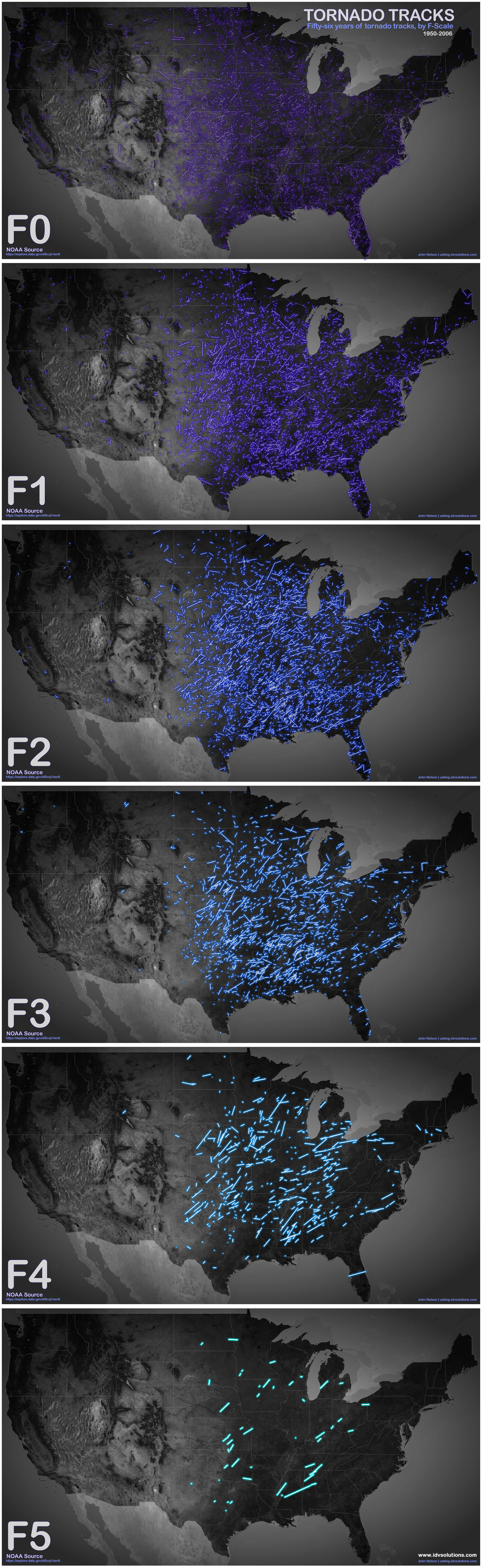
Got this data from NOAA via the spectacular Data.gov. It tracks 56 years of tornado paths along with a host of attribute information. Here, the tracks are categorized by their F-Scale (which isn’t the latest and greatest means but good enough for a hack like me), where brighter strokes represent more violent storms.
The F-scale Nelson is referring to is the Fujita scale, which ranks tornados according to windspeed and destructive potential on a six-point scale ranging from F0 (40–72 mph winds and a few broken tree branches) to F5 (261+ mph winds and holy crap flying semi trucks).
Things get even more interesting when Nelson splits the visualization across six separate maps according to F-Scale [click for hi-res]. As much as I like the first map for its all-encompassing, almost overwhelming quality, seeing the tornadoes spread out according to severity helps illustrate how common (or uncommon) they actually are. It makes identifying their geographical impact more manageable as well, helping illustrate something we brought up earlier this week: for as common as tornadoes seem, your chances of coming face-to-face with a house-leveling twister are actually pretty slim — even in tornado alley.
https://gizmodo.com/10-things-you-probably-didnt-know-about-tornadoes-5915325
Read more over at IDV User Experience. You can also purchase prints of these great visualizations here.

