Okay, it’s a big iPod. Maybe in more ways than we expected. Until you start touching the interface. Here’s a visual guide to the iPad’s interface, screen by screen. (And of course, check out our definitive hands on.)
https://gizmodo.com/apple-ipad-first-hands-on-5457757
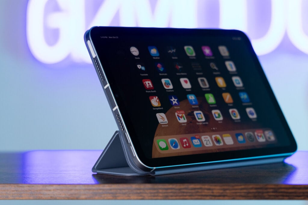
This is the home screen.
The new iCal!
And in portrait.
Pop-ups like this one abound in the iPad UI.
Contacts.
Google Maps. It moves really fast.
Aaaand StreetView.
The lock screen, still useless. And such a tiny unlock strip!
The home screen in landscape, notice the glistening Dock.
The videos app.
This is what it looks like when you click on a movie.
Settings, lots of settings.
The iTunes Store for iPad.
Aaaand in portrait.
The iBooks bookshelf.
Two pages at once, suck it Kindle.
The tablet of contents.
Photos, so many photos on this thing.
Pinch to explode.
The YouTube interface is surprisingly nice.
In iTunes, there is no Cover Flow, just real big lists!
And grids.
On of those pop ups again, but for laying music.
The Mail app, I like—it’s like a widget-y widescreen version of the iPhone app, stuck next to a fullblown Mail app.
PDFs open real fast.
Oh hey, a big keyboard. It kind of sucks, at least trying to use anything more advanced than a hunt-and-peck technique.
TYPETYPETYPETYPE