When Hawaii accidentally terrified residents earlier this month with a push notification about an imminent “BALLISTIC MISSILE THREAT,” the Internet seemed to cry out in unison: Okay, who pushed the wrong button?
An employee at Hawaii’s Emergency Management Agency was apparently responsible for the error. Intending only to test the state’s missile alert system internally, the employee clicked a wrong button or link by mistake and sounded a very real alarm, leaving people uncertain about whether their very lives were at stake. The agency only recently restarted internal drills for the Cold War-era system.
Yet when the Honolulu Civil Beat published an alleged photo of the alarm system’s interface, it seemed clear—at least to many designers—that the employee was not entirely at fault. As many outlets have pointed out, it was a design problem, because the interface looked like it had been made to deliberately confuse whoever had the sorry responsibility of actually using it.
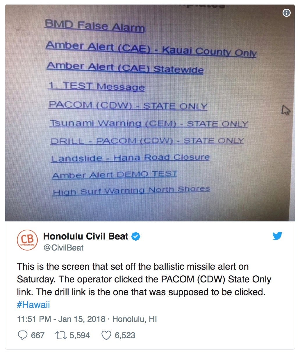
This is the screen that set off the ballistic missile alert on Saturday. The operator clicked the PACOM (CDW) State Only link. The drill link is the one that was supposed to be clicked. #Hawaii pic.twitter.com/lDVnqUmyHa
— Honolulu Civil Beat (@CivilBeat) January 16, 2018
This image drove UX designers into a state of rage and sent commentators into action, who explored the usability of warfare and compared the design to Mailchimp’s far more ominous-looking deletion alert. And now there is even an independently run contest on design crowdsourcing site Freelancer, which is seeking entries for a better design. The site itself is funding the contest and will reward $150 to the winner. There are 146 submissions to date, many of which are hideous and none of which will probably wind up changing how HEMA thinks about design.
But to be fair, this also isn’t a competition over aesthetics. It’s possible to create a very ugly design that’s simultaneously easy to use, just as it’s possible to create something attractive and trendy that’s a confusing nightmare. Here’s a handful of the entries:
The story surrounding the graphic, it turns out, is more complicated than it originally seemed. The Civil Beat later reported that the photo it published did not actually depict the interface that was used to trigger the alarm.
The distributed image was apparently just a mockup. “[The] State of Hawaii is saying the original screenshot shared with the media is merely an example and has shared a second image saying it is another example of the user interface. Neither screenshot shows the actual interface used by the operator,” reported the Civil Beat. The agency apparently “can’t publicize the actual screen because of security concerns.”
Right. So let’s see the agency’s best approximation of the interface.
Neither HEMA graphics conjure up, say, the sort of image you might have imaged would be present in a missile alert system—like, say, some sort of big red or green button? Simply because there are fewer options present, this interface is a lot easier to read. But could better design really have prevented the error, and going forward, prevent future false alarms?
At this point, it may not be possible to reach a verdict without seeing the actual design, and the missing context surrounding these options further muddies the situation. What designs proceed the interface above? What do other, comparable alert interfaces look like? This information isn’t readily available.
An entirely different kind of solution may come to fruition. Yesterday Senator Brian Schatz called for a law that would ban state and local governments from issuing missile alerts, Reuters reported. Both the House of Representatives and Senate have additional hearings planned on the matter. The FCC is also investigating the matter.
The employee responsible for the alert is apparently “refusing to cooperate” with the FCC’s investigation, according to the agency’s public safety head, Lisa M. Fowlkes. It’s not clear why this anonymous government employee is allegedly avoiding the FCC, but at least they can rest easy at night knowing that designers on the internet genuinely don’t believe they are entirely at fault.