
Scoring a color’s sexiness calls for a sketchy rubric at best: Although someone appointed it the color of romance and passion, red is also the color of blood and chaos (see: panic buttons, fire trucks). Sleek, sophisticated black does double duty as the uniform of death. Purple can communicate richness, royalty, sensuality, what have you; it can also announce gout, bruising, raw meat. Pink is pretty, if also heavily associated with babies, emphatically unsexy creatures. The same argument could be made for blue, whose calming vibes also call up medical wardrobes. White similarly signals sterile, hospital environments, unless it’s dirty, in which case it’s dingy.
Fun Factory
Then there’s orange, reserved for hunters and construction cones and other items that shout LOOK OUT; green, the color of nature, that also characterizes mold and decay; and yellow, who even likes yellow anyway? But when you’re slinging sex toys, you have to make them some kind of color. So: how do you pick a winner when every winner is also a loser?
“Any color you come out with, some people are going to tell you it’s the best color in the world, some people are going to tell you it’s the worst color in the world,” Janet Lieberman, co-founder and chief technology officer of sex toy startup Dame Products, told me.
While about half their customers report not caring about appearances, added Dame co-founder and CEO Alex Fine, “There are some colors that people have opinions about.”
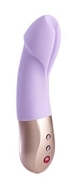
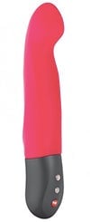
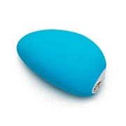
Dame Products
When Fine and Lieberman introduced their follow-up product to their buzzy hands-free vibrator Eva, they consulted a color trend specialist to help them find the most salable hues. Every Dame vibrator comes in two colors, one warm and one cool, that need to jell together as well as with the larger group.
For their finger vibrator, Fin, the pair chose jade, a minty seafoam, and coral, a Dreamsicle orange. The latter bombed, and faced with consistently low sales, the pair decided to replace it with something less objectionable. But when we’re talking about something so subjective as color preference, it’s hard to say exactly what “objectionable” means.
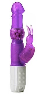
For many, the first mental image associated with the word “vibrator” may be that of a vaguely phallic form in My Little Pony pinks or purples. For a long time, that was the norm, but recent years have seen a shift away from dismembered dicks and toward more sexually ergonomic shapes designed for a more diverse array of bodies. The color palette has expanded, too, but the Pantone swatch that pleases everyone remains impossible to find. In reporting this story, I asked five vibrator brands how they assigned hues to their products. Each process was as unique as color preference itself, but the careful calculations involved were far more nuanced than I ever would have guessed.
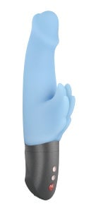
The usual suspects
from Pleasure
Works
According to Hallie Lieberman—author of Buzz: A Stimulating History of the Sex Toy—vaginal vibrators broke from their putty-toned hard plastic molds in the ‘80s, designers cautiously dipping their toes into the color spectrum. Whether because certain pinks mimic certain skin tones or because—whether we’re talking tools or guns or sex toys—manufacturers use pinks as shorthand to whisper “for women,” Lieberman couldn’t definitively say, but everything came up roses. And while the ‘90s ushered in phalate-laden jelly plastics available in garish new hues, the emergence of high-end sex tech companies meant designers started thinking critically about color. Two decades on, a vibrator rainbow has highlighted a few patterns.
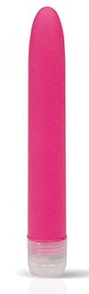
Almost uniformly, the sex toy companies’ representatives with whom I spoke said blacks, purples, pinks, and blues topped North American sales charts; reds, meanwhile, put people off—unless the red veered toward maroon or berry. Green and orange proved prohibitively hard to move, collecting dust on stock room shelves alongside skin toned vibes. Yellow always ranks low in the color preference hierarchy, no matter what you’re selling.
Asked why they think these trends persist, the product experts had a few ideas: red and yellow recall bodily excretions many people want to keep off their sheets, or road signs signaling danger ahead. Orange falls in that camp, too, while skin tones risk making certain vibrators look like unwieldy skin tags, “bizarre fleshy overhang[s]” as Dame’s Lieberman put it. Then, “the furthest thing from their mind when they look at green is sex or pleasure,” mused Shay Martin, vice president of Rabbit purveyor, Vibratex.
Blue, despite its associations with frostbite and thwarted orgasm, is actually the most widely accepted color in the world, at least according to environmental psychologist Sally Augustin, PhD, principal at Design With Science. People associate blue “with dependability in our culture, trustworthiness,” Augustin explained. “Sort of like something is your good friend.” Which, at the bottom of all this, is really what you want your vibrator to be: a reliable old faithful.
Following a three-decade reign over the vibrator market, pink feels somewhat stale—if also familiar. Apparently, it polarizes customers: People either list it as their top choice, or their last. But which color rules them all? “Purple,” said Coyote Amrich, director of purchasing and product development for Good Vibrations and Babeland, who’s watched the color rise over her fourteen years as a buyer. “Whether you like it, love it, hate it, or are indifferent to it, it just is always the top-selling color of any product that comes in a variety of colors.”
The red shoe effect
For most people, vibrators—with their high price points and lingering stigma—constitute an occasional purchase at best. Retailers may want products with proven appeal, and that inclination to play it safe led some toymakers to believe buyers had driven the industry toward a narrow palette. They know pink and purple sell, so they keep stocking pink and purple, passing over more unusual colors that could present a risk. And while that might be true outside high-end retailers like Good Vibrations, Amrich says she makes a point of buying more experimental sections of the color wheel alongside the predictable sellers.
from Good Vibrations
“I remember a time when our store literally had nothing but purple, pink, and blue, and I think that was the day that I as a buyer decided to bring in a greater range of colors,” said Amrich. Willing to absorb whatever sales hit came with the decision to diversify, Amrich explained that “it can be really overwhelming, color-wise, if you walk to a shelf or an area of the store and you want to discern the products, [but] you just see a color monotony.” And while unusual colors tend to sell better in settings where people can interact with them, they also serve another important purpose.
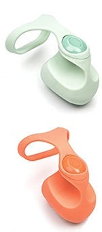
“When I launch a product, I do two colors that are bestsellers in most places, and then I always add a non-traditional color,” explained Kristen Tribby, Director of Marketing and Education for the German sex toy company Fun Factory. “Sometimes we end up discontinuing it later, but … because that color is so different from anything else in the store, it brings the customer to our products. And they might not pick that actual color, but it brought them there. So it’s a nice blinking light, basically, to help consumers reach our products.”
from Fun Factory
When it launched in 1996, Fun Factory shook up the marketplace with its candy-colored vibrators in whimsical shapes. The goal, Tribby told me, was to make sex tech look less medical—no more rigid vagina prods in varying shades of beige—and more approachable. Cruising through Fun Factory’s product pages today feels like the adult equivalent of scanning the jumbo Crayola box: A color for every occasion. A minimalist grass-green worm; an abstract, butter-yellow blossom; a flickering orange flame; a carmel cock—some of Fun Factory’s toys seem destined for stillbirth, judged against the aforementioned trends. But that pop of orange might actually function as a flare over a sea of the usual suspects.
Dame’s Lieberman has a name for that phenomenon: The red shoe effect. A red pump placed alongside a rack of black shoes draws the eye, she said, and even if the red option doesn’t sell, it drives sales for items that might otherwise fade into the background. That’s actually what she and Fine saw with their coral Fin: Placing its photo first on their website boosted jade sales. Sometimes, an attention-grabbing-if-also-arguably-ugly color serves as the bait that hooks your customer.
Find a color to fit the vibrator’s character…
But not everyone sees these shades tank. Iroha, for example: A by-women-for-women sex toy brand based in Japan, its uncommonly bespoke color selection process “is more based on what will suit the product and what will suit the lineup as a production piece, not so much what is going to sell the best,” according to Tina Carter, who handles advertising and public relations for Iroha’s parent company, Tenga.
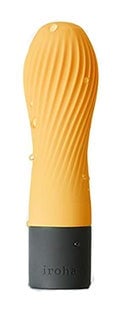
from Iroha
When they introduce a new product, they do so with the intention of filling a hole in the lineup. “They sit down and start thinking about the theme of the series, what the personality of the series is going to be like, and they start looking at what the shapes will be,” Carter explained. Color comes after each vibe gets its name, and has to check a few boxes: It has to fit not only with its series partners but also with the larger brand aesthetic—wah, loosely defined as harmonious and soothing—and it has to suit the particular form. From there, the design team 3-D prints models of each item, hand-painting them to fine-tune the shade.
Iroha uses light greens, subdued oranges, deep reds, and even bone. Most of their series comprise three separate shapes—a snowman, a bulb, and a cherry blossom petal; a hedgehog, a bird, and a whale—which muddies the waters somewhat: You don’t immediately know when someone responds to shape and when someone responds to color. Still, Carter has noticed one clear pattern: “People are the most actively engaged with the more unusual colors, and people will go out of their way to say, ‘Oh my god I love that there’s a green one,’ ‘Oh my god this green is so cute,’ versus the white and the pink might be more common,” she says. And actually, she added, in certain series—like the Iroha Zen, which features three battery-operated vibes of the same shape—the allegedly unpopular colors end up selling best. Carter said the green was “far and away the most popular” Zen, while for Good Vibrations and Babeland, Amrich said orange performed well.
from Vibratex
Martin, of Vibratex, agreed that when it comes to color, a vibrator’s character is king. “If you have a really fun playful vibe, it seems weird to put it in a deep serious rich tone,” said Martin. “You want something light and playful to go with that.”
In her 35 years coming up with color schemes, Martin said she’s learned to stay away from trends and to hunt instead for the color that suit the particular product’s mood: She pulls out her Pantone book and blind tests the swatches, flagging the ones that jump out at her. She returns to the book a few days later and if she selects the same or similar panels—and if those panels don’t strike too close to well-trodden territory—she knows she’s on the right path.
…and to fit its form
Much of color selection comes down to shape, and with less emphasis on phallocentric forms, color helps abstract objects pop. Consider We-Vibe, a Canadian couple that launched the first hands-free couples vibrator in 2008. In keeping with their aim to make the most luxurious and well-crafted vibrator out there, marketing manager Stephanie Keating tells me, the design team chose—what else—a rich, regal purple.
We-Vibe doesn’t operate along a set color selection process, Keating told me; rather, they get together as much data as they can—from surveys, focus groups, retailers, Pantone’s annual trend analysis—to zero in on potential shades for new additions. Then comes a round of FDA testing: Colors might leach when rendered in silicone, Keating explained, or simply come out looking muddy and dull in a matte material that doesn’t reflect light. And that is the opposite of what We-Vibe customers want: “When people are shopping in adult stores, they really are looking for something that like evokes excitement and fun,” she said. “We try to implement that in our colors using brighter, bolder colors that evoke excitement and play, as opposed to using a lot of muted stuff.”
“Brighter colors, bolder colors, tend to emphasize the shapes of products,” Keating added, nodding to a palm-sized vibe called the Wish, reminiscent of a bright, aquamarine skipping stone. “When we had it in darker colors, it kind of looked like a … blob,” she said. “The shape almost disintegrated.”
Put together all these variables, and you find yourself with a tricky equation to balance: The color has to match the vibrator’s personality and enhance its shape in product photography, while also rendering in silicone. The shade can’t stray too far from a saleable family, unless intended as a red shoe, in which case the brand must brace for some unpredictability.
With so many variables to square, what’s the best color for a small, organically shaped couples’ vibrator with deep contours that cast wonky shadows? Dame went with a coral replacement recommended in their previous rounds of color consultation, product testing, and focus groups: a soft navy that, to my mind, promises to make the fish-like Fin look like a little shark. Fitting, but also a safe bet: “Blues are the least objectionable color,” Lieberman said. One thing is guaranteed, though: someone out there will hate it.
Disclosure: the author also writes for the Dame Products blog.


