Before the Apple Watch, there was the Pebble—the smartwatch that raised an incredible $10.3 million on Kickstarter. The smartwatch that managed to outsmart Google’s Android Wear. The Best Smartwatch according to critics everywhere. For the past six days, I’ve been wearing its successor: the Pebble Time. It’s the most fun I’ve had with a smartwatch yet.
What Is It?
A wristwatch with a tiny computer inside, plus a tiny 1.25-inch color e-paper screen that delivers notifications from your smartphone, easy access to your calendar, and tiny apps. Works with Android and iOS. Four buttons to scroll and select things. A microphone to send voice replies to texts and emails. Removable lugs so you can attach any standard 22mm band. Sensors so it can act as a basic fitness tracker. Enough waterproofing for a vigorous swim. No limit on the number of apps you can install, unlike the original Pebble.
Why Does It Matter?
Apple and Google are promoting powerful wrist-computers that run cut-down versions of full smartphone apps. Pebble thinks differently. The new Pebble Time doesn’t feel much more powerful than a high school graphing calculator. But because of that, it (allegedly) lasts up to a week on a charge instead of just a day or two. And perhaps more importantly, it’s dead simple to use.
Why Isn’t This a Review?
I haven’t spent long enough with the Pebble Time—just five whole days including a lazy Memorial Day weekend—and it’s not like you can buy one anyhow. Unless you’re one of the 78,000 people who already shelled out during the Kickstarter campaign, which means you’re getting one no matter what I tell you. Pebble won’t sell it at retail until every Kickstarter preorder has been fulfilled.
Which is probably just as well, because the Time is a pretty limited product right now.
Update 7/2015: The Pebble Time is now available, but our conclusions are pretty much the same. The somewhat dim screen might be a dealbreaker.
Design
Compared to the Apple Watch or the LG Watch Urbane I recently ripped off my wrist, the Pebble Time feels a little bit cheap. It’s a plastic smartwatch where others are made of metal—though it does have a sleek stainless steel bezel surrounding a glass window, so it’s not like it’s made of sub-par materials or anything. In fact, I think the white silicone band is actually pretty fantastic. It’s nearly as silky-smooth as the one I loved on the Apple Watch.
And honestly, I like how the Time sits on my wrist, too. It’s just thinner than most other smartwatches, and “I forgot I was wearing it” light. It’s nice and evenly proportioned compared to some of the wrist-dominating metal bricks that other manufacturers are pushing. My white model doesn’t look expensive, but I do think it looks stylish.
What I don’t like, unsurprisingly, are the exact same things I didn’t like about the original Pebble:
1.) The buttons are painfully stiff
2.) The charging cable has tiny, weak magnets, and doesn’t reliably stay connected.
It blows my mind that the biggest issues with the original Pebble are still here, particularly now that the competition has come so far. Every single Android Wear device I’ve tried has a more secure charger. And there wasn’t a moment I didn’t miss Apple’s amazing scroll wheel.
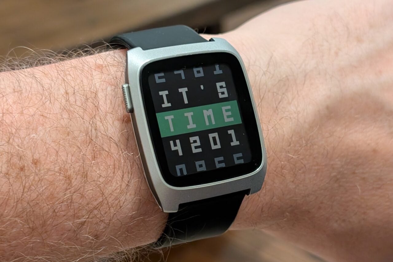
Oh, and compared to other smartwatches, the 1.25-inch screen on the Pebble feels really, really tiny, with a giant bezel around the border of your view. It can be hard to read tiny text (Pebble says the ability to adjust font size is coming), and not a lot of it fits on screen at a time. The backlight’s pretty dim, too. The Pebble Time still uses a transflective screen—meaning it reflects light, making it super readable in bright light—but in darker conditions it can occasionally be hard to make things out. I feel like I’m getting used to the screen, but it could be a dealbreaker for some people. Update 7/2015: Nope, we haven’t gotten used to the dim screen.
Using It
Pebble’s user interface makes so much sense. Everything happens in two columns: one for your Timeline, and one for apps.
Timeline: from your watchface, you simple press the up and down buttons to move forwards and backwards in time. Go forward, and you’ll see your upcoming calendar events, alarms, and reminders, plus morning and evening weather reports. Go back, and there are your missed calls, your previous alarms (when did I wake up this morning?) completed goals and so on. You can go up to two days in either direction.
Press the right (select) button, and you go a layer deeper. Want more info about that weather? Why did that alarm go off? Press the left (back) button, and you go back where you came from. You can even interact with some Timeline items by pressing select again.
Okay, so that’s the Timeline column. To get to the apps column, you just press the right button from the watchface instead of from a calendar event. Then, you get an infinitely scrolling column of all your apps. Hold down the directional buttons to zoom through them. Again, tap the right button to dive deeper, or the left button to surface again.
If this sounds a lot like Google’s latest Android Wear interface, or even the Apple Watch, that’s because it kind of is. Android Wear even has two columns now: apps on the right, Google Now cards on the left. Each of the major smartwatch UIs separates the ambient, helpful information it pushes automatically… from the apps you have to actually choose to use at any given moment. It’s a good idea for all involved.
The wonderful thing about Pebble is that you always know where you’ll find what you want. By contrast, Google Now throws cards at you out of the blue, suggesting information it thinks you’ll like—sports scores, local check-ins, etc. Swipe them away, and they’ll vanish, never to be seen again. Apple hides its information in Glances and inside apps, and it’s a chore to navigate through. But with Pebble, those sports scores are right there in your Timeline at the time they arrived. Just scroll up to find them.
https://gizmodo.com/i-beta-tested-the-apple-watch-so-you-dont-have-to-1703824830
Oh, and you can long-press the top or bottom buttons for shortcuts to any two apps of your choice, too—which goes a long way towards solving the smartwatch dilemma. It can make thing quicker than pulling out your phone.
The Tragic Flaw
The terrible thing about Pebble is that it’s entirely relying on app developers to make that awesome interface useful. Thanks to partnerships with The Weather Channel, ESPN, Foursquare and a few others, I can see those aforementioned sports scores, weather reports, and check-ins in my timeline, plus my calendar events… but that’s about it. My Timeline feels kind of barren. And that’s because Pebble is at the mercy of Google, Apple, and app developers for everything else this watch does.
Pebble isn’t Google. It doesn’t have giant servers and databases filled with the world’s information. It’s not digging through my calendar and email so it can automatically pop up my flight status at the right time. It can’t easily prompt me with driving directions to my next meeting. Though the new Pebble has a microphone, there’s no Google Now or Siri or Cortana to help me issue voice commands from my wrist or quickly look up things.
And you can’t expect to just control Google and Apple services with the buttons, either. Though the Pebble Time does let you archive Gmail messages and even reply to them with canned messages, emoji, or (slooooow) speech recognition, I can’t read entire emails without popping over to the phone. I can’t reply “Yes” to calendar invitations with a single tap. I can’t launch driving directions even if there’s an address right there in the notification that just got pushed to my watch. I miss these things.
But not as much as I thought I would.
The Silver Lining
The Pebble Time is fun. It’s warm and inviting in a way the other watches aren’t. Part of that is simply that it’s always on. The screen never needs to turn off to save battery.
Part of that is awesome little cartoony animations throughout the interface that make the Pebble come alive. Dismissed notifications get all torn up by a cute little paper shredder. Replies are a paper airplane zipping away. Charge the watch and it gets a virtual coffee drip. A lazy sloth comes to visit if you don’t have anything scheduled on a given day. The animations help mask any lag in the interface, sure, but they contribute more than that.
The other part is the incredible creativity of Pebble’s indie app developer community. Sure, I can’t get Google Maps on the Pebble. But some genius built a Pebble app that automatically detects when I start turn-by-turn navigation on my phone, then pipes directions to my wrist as well. Another built a Caltrain app that’s faster and easier to use than the official one on my smartphone. There’s no official Nest app for the Pebble, either, but the one I’m using here controls my smart thermostat perfectly, and looks good too. Another app, LetsMuv, does sleep tracking, stand alerts, and helps me ring my phone all from a single app tile.
That’s not to mention all the awesome watchfaces you can get.
And as worried as I am that these developers might jump ship for Android Wear or the Apple Watch where profits might be higher, I think Pebble’s doing the right thing with its app store, too. When you browse the Pebble app store, you’re solely looking at awesome tools and games you can add to your wrist — nothing else. I can’t understand why Apple and Google decided to hide watch apps inside phone apps on their appstores, but they do—meaning you can’t just browse through watch experiences with Apple or Google, and you can’t tell if they’ll be any good since you’ll be reading reviews for the phone app, too.
The best part about the Pebble is discovering what your wrist can do.
Review Notes
Should I Buy It?
Well… you can’t unless you already did. Until the Kickstarter backers get their orders in, this smartwatch won’t go back on sale. Second, I think it’s worth waiting to see if the platform gets some software updates to address its deficiencies, and for app developers who bought the device on Kickstarter to get cracking on their apps. Third, the $300 Pebble Time Steel will also be coming soon with a more luxurious body and more battery life, and I bet you’d like to know if it’s worth the extra money. Fourth, smartstraps are coming. Fifth, Android Wear and the Apple Watch might be better by the time all that happens.
https://gizmodo.com/these-are-pebbles-secret-weapons-in-the-smartwatch-war-1689100683
I only tested with an Android phone, not an iPhone.. but Pebble admits the iPhone software is lagging the Android software a bit. It can’t do voice replies to emails yet, for instance.
Haven’t been able to test the battery life for long enough to be sure, but I did see my Pebble Time die after only three days of (admittedly heavy) use. Update: We’re regularly getting 3-5 days on a charge. Wish you could see the battery life percentage more easily.
It charges up quickly, though: if I plug it in during my morning shower each day, I can top it back up to full. Between that and the definite 3+ days of battery life, I feel comfortable sleeping with it on instead of charging it every evening.
Which is awesome, because it means I can use it to track my sleep and vibrate my wrist to wake me up each morning, instead of using a noisy phone. Silent alarms are great.
Having Evernote for to-do lists is pretty rad, just like on Apple Watch and Android Wear.
Waterproof to 30 meters, but I’ve only showered with it as of today. Update: Waterproofing seems good. We’ve been swimming and cliff diving with it a few times now.
Not nearly as good for hands-free use as an Android Wear device. The lack of voice commands means it’s not so useful in the car.
I was told this smartwatch would have a voice memo feature. Haven’t figured out how to activate it yet.
Feels too reliant on app developers to build out what’s starting to become basic smartwatch functionality, like actionable notifications. I really miss being able to just say Yes to calendar invites from my wrist.
As much as I like having real buttons instead of a touchscreen, these buttons aren’t so great—and Pebble’s column-heavy interface could really use a scroll wheel.
Why can’t I hold down the buttons to scroll through the Timeline or notifications, like I can when scrolling through apps?
Unlike the original Pebble, you can’t mark Gmails as read—only archive them.
Some watch apps require companion apps on the phone—like Pandora—and will prompt you to download them even if you’ve already got them installed.
I wish the default silicone straps—which I otherwise quite like!—had a cushioned buckle like the Apple Watch, so I could wear them all day without fear of scratching up my desk, laptop, and other surfaces I place it on.
But I can already tell you—pending a lengthier battery life test—that the Pebble Time is a better pick than the original Pebble. In just about every way, it feels better, and since those were two of our Best Smartwatch recommendations, it seems likely the Pebble Time will be the new champ. Honestly, It’s the most fun I’ve had with a smartwatch yet, and in some ways it even makes more sense than the high-profile competition. Sure, I wouldn’t buy one for $200. Not yet. But if you’re sold on smartwatches, it’s hard to do much better.
Update 7/2015: After months of use, it’s actually a bit of a tossup between the Pebble Time and Pebble Steel! Check out our piece on The Best Smartwatch to see what we mean.
Contact the author at [email protected].