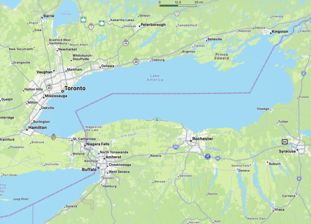
Maps have been in the news of late, largely because of the forelock-tugging pusillanimity shown by Google and Apple in rushing to implement Donald Trump’s latest half-hearted attempt to redraw the map to his liking, this one regarding Lake Ontario. But for all the patent absurdity of Trump’s recent tantrum, it should serve as a reminder that maps are—and have always been—inherently political.
There’s no more profound demonstration of that fact than the map of the world. The fact that the earth is a sphere means that there’s no way to project it onto a two-dimensional surface like a piece of paper or a computer screen without distorting its surface one way or another. But the choice of which way to distort the surface is as much a product of history and politics as it is of practicality.
The familiar Mercator projection was devised in the 16th century as a navigational aid, because it has two advantageous properties: it renders both circles of latitude and meridians of longitude as straight lines, and it’s conformal, i.e. it preserves angles. These properties were invaluable for navigators—and remain so today—and they also proved attractive to Google et al when putting together their mapping services centuries later.
To achieve these properties, the Mercator projects the Earth’s surface onto a cylinder, with circles of latitude mapped to the cylinder’s diameter and meridians of longitude running vertically along its surface. But on an actual sphere, circles of latitude get vanishingly small toward the poles. If you render them all as the same size, your projection gets increasingly distorted the further you get from the equator. This explains the Mercator’s most well-documented flaw: landmasses toward the poles look significantly larger than they actually are, while those near the equator look smaller.
And wouldn’t you know it, the landmasses that have their size inflated by the Mercator projection are the traditional seats of white economic power—North America, and pretty much all of Europe and Russia—while those that don’t fall neatly into the global south are Central and South America, the Indian subcontinent, southern and central Asia and, most notoriously, Africa. (Wikipedia has an excellent visualisation of this.)
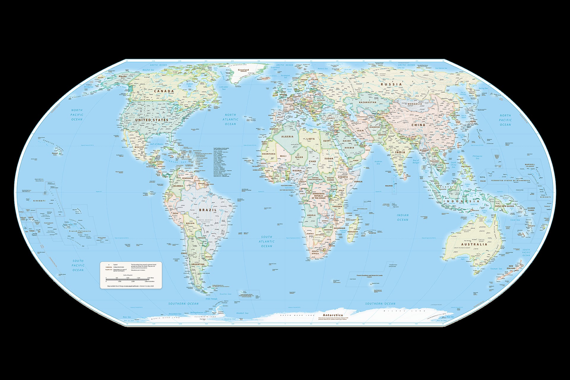
African countries have often voiced their disapproval of the way the Mercator projection distorts the continent’s size in relation to the rest of the world. And on Friday, the UN approved a resolution sponsored by the West African country of Togo, and endorsed by the African Union, that asked for the official adoption of the Equal Earth projection to replace the Mercator projection. UN resolutions are non-binding, but the adoption of this resolution could help put pressure on publishers and tech companies to adopt the Equal Earth projection.
So how does that projection work? Well, it’s a pseudocylindrical projection: it preserves parallel circles of latitude, but those circles decrease in radius as they approach the poles, and unlike the Mercator, it uses curved meridians of longitude. It was created in 2017 as a way of providing a more accurate depiction of the relative sizes of different areas than the Gall-Peters projection, an older equal-area projection.
To be clear: no one is suggesting that Mercator himself was orchestrating some grand conspiracy to minimize the size of Africa when he made his map, and it’s easy to dismiss the ubiquity of that map—500 years after its creation—as an accident of history. But if that’s the case, correcting that accident should be pretty uncontroversial, and the Equal Earth projection is clearly superior to the Mercator for the majority of today’s purposes.
“A fair world begins with a fair map,” Togo’s Foreign Minister Robert Dussey told Reuters on Friday.
While the Web Mercator’s conformal, north-preserving qualities are useful at small scales, no one is using it to sail a clipper ship through the Roaring Forties in search of a route to the spice islands. When most people look at a map of the world, they want to see what the world looks like. If the Equal Earth projection is a more accurate picture than the Mercator projection of the relative size of the Earth’s landmasses—and it is—then there should be few objections to its adoption. Right?
Well, according to Reuters, the United States was the only country to vote against the resolution.
No doubt the usual comment section types will find reasons to oppose the change, but beyond them, the most likely objection is that making changes like this is difficult and expensive and so on and so forth. But let’s remember just how quickly Lake America became a thing. Sure, changing the map of the world is more of an undertaking than changing the name of a lake. But people tend to find ways of doing things when they want to do those things—and of not doing things when they don’t. And if it’s the latter, it’s always worth thinking about what might be.