This image may look like a splatter of abstract digital artwork, but it’s actually a map of the far side of the moon. A far cry from the monochromatic topical maps that we’re used to seeing, these colorful maps instead document the surface reflectivity of geologic features throughout our solar system.
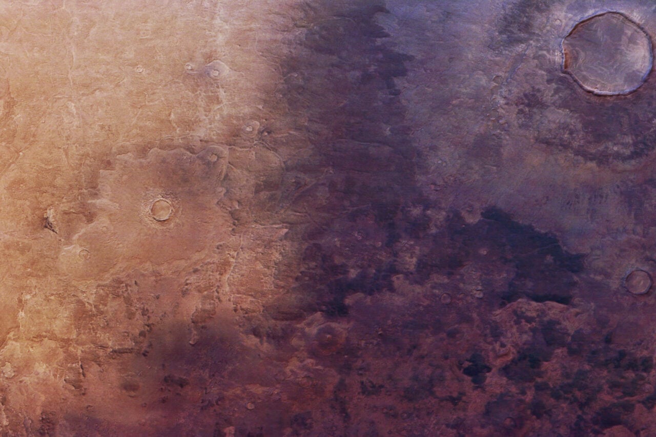
The different colors on these maps correspond to different features on the surfaces on the moons and planets throughout our solar system — such as basins, craters, mountains, and plains. They just serve as a different presentation of the data we’ve received from the various space missions, though they offer their own insights into the various rocky bodies orbiting our sun.
All images by SPL/Bancroft Media.
Artistic planetary maps: colourful images of our solar system [The Telegraph via Explore]
Map of Ganymede
Map of Mercury
Circular Map of the Moon, displaying that the far side (upper half) is more heavily cratered than the near side (lower half).
Map of the Martian Equator

