The US has entered the 34th day of a crippling heat wave, with no sign of relief in sight. According to the National Climatic Data Center (NCDC), July’s broiling temperatures affected close to 200 million Americans, and set 2,755 daily-high records across the country — including at least one record in every state.
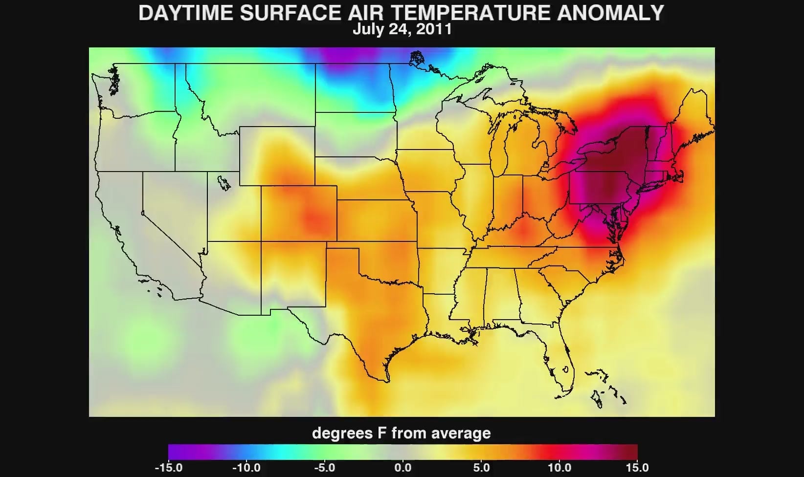
The map above is from NASA’s Earth Observatory, and depicts something called “land surface temperature anomalies” from July 20-27, when the heat wave reached its peak intensity across much of the United States.
The map works a little differently than your typical heat map; instead of depicting absolute temperatures, the image uses color-mapping to illustrate the difference between average temperatures for the week of July 20th and the long-term average temperatures for regions across the US. So this map is showing you how unusual the temperatures were across the country.
For a better idea of how the heat wave evolved over the course of July, check out the lime-lapse videos depicting temperature anomalies for daytime and nighttime surface air temperatures.
Daytime Surface Air Temperature
Nighttime Surface Air Temperature
NASA Earth Observatory image created by Jesse Allen, using data obtained from the Land Processes Data Active Archive Cemter (LPDAAC) data pool.