
Google+ just got a total overhaul to its already-pretty-pretty design. The layout, navigation, and features have all been updated and beautified. It actually looks pretty good.
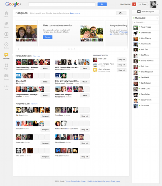
First, navigation. There’s a new navigation ribbon on the left side of Google+ with draggable icons for for your profile, photos, hangouts, and other Google+ apps. Google’s also emphasized sharing large photos and videos, from anywhere on Google—YouTube, search, etc. And there’s a new Hangouts page so you don’t have to set them up specifically or haphazardly bump into them in your stream. There’s also a new Twitter-like trending box in the upper right corner of your homescreen, which ties into the full-network-trending Explore page.
No one’s ever questioned that Google+ is a well-designed, thoughtful social network—it’s just been a matter of getting butts in the seats. If Google’s really serious about making this redesign apparent in all facets of using anything Google, this might make that happen. [Google]


