https://www.youtube.com/watch?v=djw6AJqHFOU
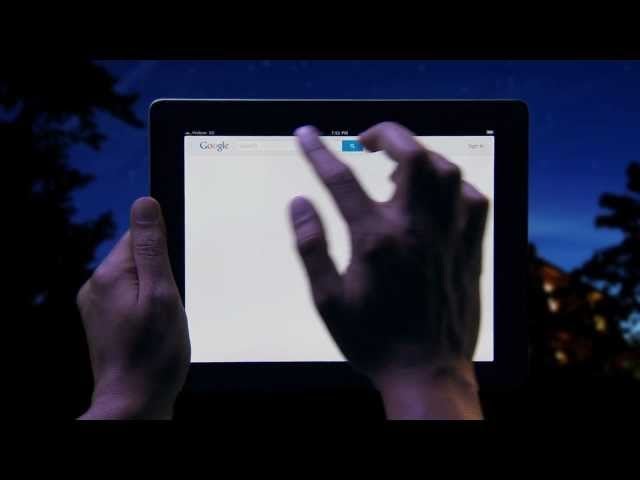
Google Search for iPad just got a huge update that completely redesigns the tablet search experience and it’s sweeeeeet. It’s prettier, slicker, faster, uses bigger pictures, has Instant and does EVERYTHING better. The weird thing? It’s only for iPad. Android tablets are left out.
Everything makes a lot more sense in the new Google Search for iPad app. My favorite feature is the new sliding panel that acts as a web browser of sorts. How does it work? So when you click on a link from the main Search Results page now, a sliding new screen appears displaying the web page you just loaded. Read it and then swipe right to make the overlaid page disappear. Or bring it back by sliding left. Slick. It makes for a more fluid search experience—you can jump in and out of Search results until you find the one you really want to read. Think about it like being a browser built around Google Search—instead of putting in the web URL, you search.
Other new features include a new image carousel for image search results, a snazzy webOS cards-like Search history, Google+ sharing, find on a page feature, an updated Google Apps menu and tons more. After playing briefly with the iPad app, I don’t think it would be a reach to call this iPad app the best Google search experience anywhere. So Google, where is this app for Android tablets? [iTunes via Google Mobile Blog]


