I’d honestly never heard this stat before, and it’s pretty amazing how well they tightly fit together.
I ran into this intriguing infographic over on Reddit that claimed that you could fit all the planets of the Solar System within the average distance between the Earth and the Moon. I thought it would be a good idea to double check the math, just to be absolutely certain. I pulled my numbers from NASA’s Solar System Fact Sheets, and they’re a little different from the original infographic, but close enough that the comparison is still valid.
| Planet | Average Diameter (km) |
| Mercury | 4,879 |
| Venus | 12,104 |
| Mars | 6,771 |
| Jupiter | 139,822 |
| Saturn | 116,464 |
| Uranus | 50,724 |
| Neptune | 49,244 |
| Total | 380,008 |
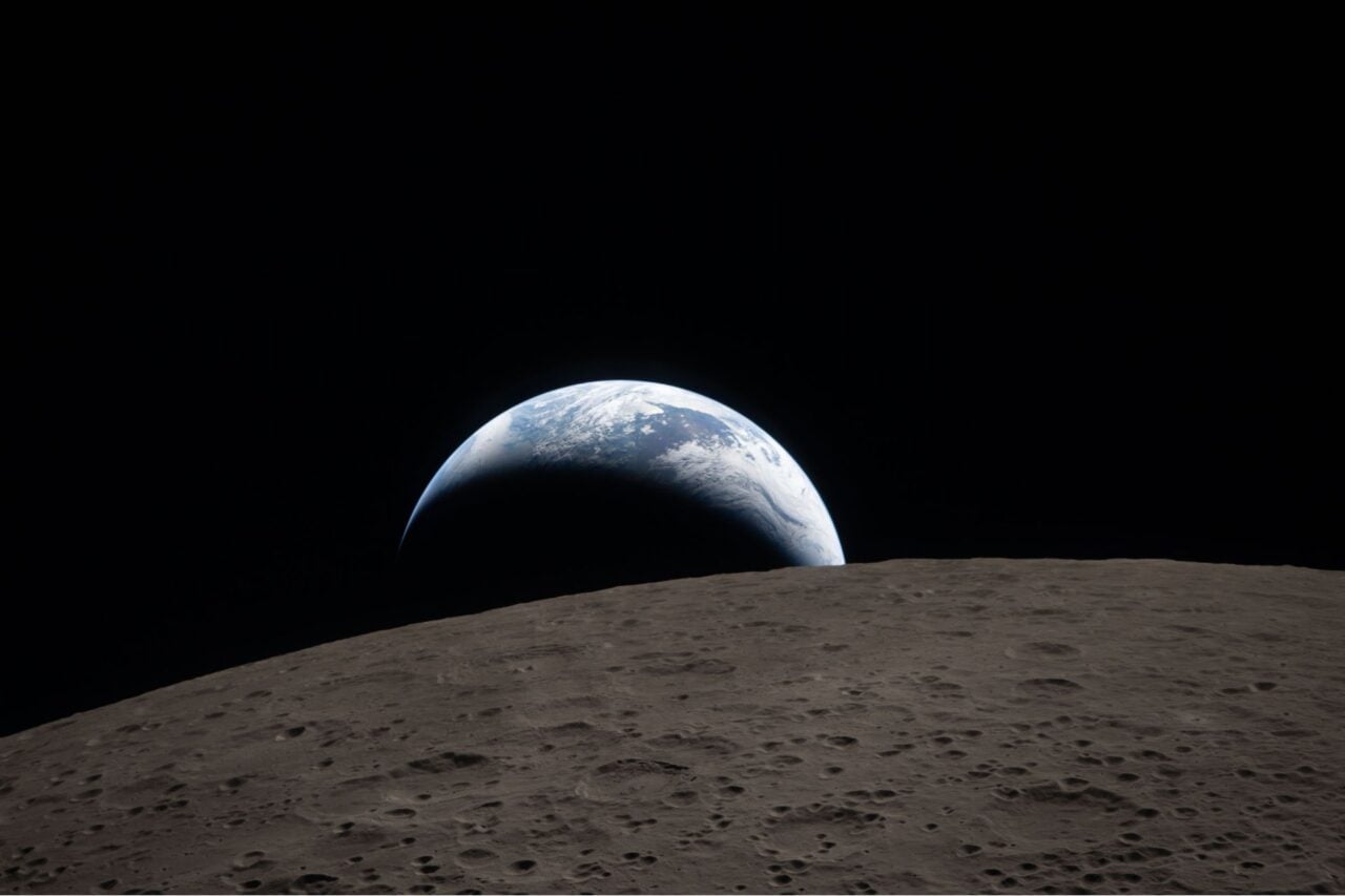
The average distance from the Earth to the Moon is 384,400 km. And check it out, that leaves us with 4,392 km to spare.
So what could we do with the rest of that distance? Well, we could obviously fit Pluto into that slot. It’s around 2,300 km across. Which leaves us about 2,092 km to play with. We could fit one more dwarf planet in there (not Eris though, too big).
The amazing Wolfram-Alpha can make this calculation for you automatically: total diameter of the planets. Although, this includes the diameter of Earth too.
A nod to CapnTrip on Reddit for posting this.
This post originally appeared at Universe Today. It has been republished with permission.


