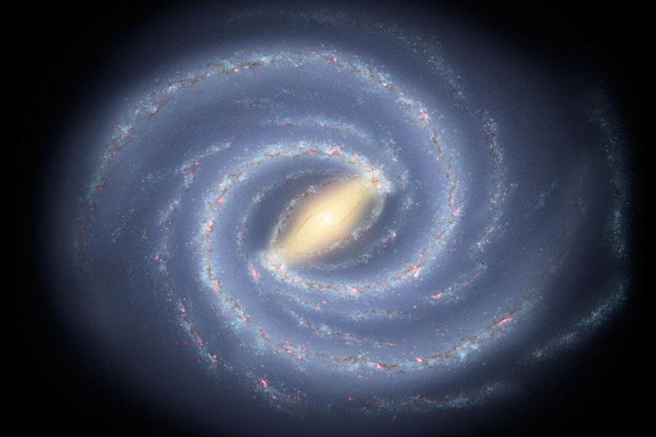
This awesome map shows the universe around us in the grandest scale possible, with each tiny dot representing a different galaxy. Thanks to this cosmic atlas, you’ll never again mix up the Corona Borealis Supercluster with the Large Magellanic Cloud.
Of course, most of those 50,000 galaxies aren’t named on this map, for two very good reasons. For one thing, there’s no way you could possibly fit all those names on a simple image, at least not at the sorts of resolutions we can handle. But more importantly, most galaxies don’t even have names, just alphanumeric designations. What you see named here (and you can expand the image up top for a closer look) are some of the most familiar galaxies.
A NASA astronomer takes us through the rest:
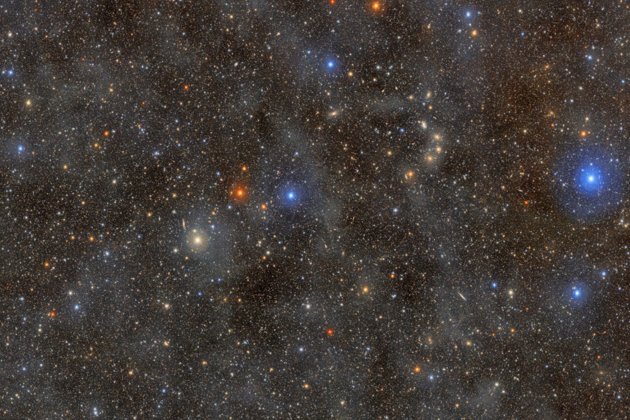
This plot shows nearly 50,000 galaxies in the nearby universe detected by the Two Micron All Sky Survey (2MASS) in infrared light. The resulting image is anincredible tapestry of galaxies that provides limits on how the universe formed and evolved. The dark band across the image center is blocked by dust in the plane of our own Milky Way Galaxy.
Away from the Galactic plane, however, each dot represents a galaxy, color coded to indicate distance. Bluer dots represent the nearer galaxies in the 2MASS survey, while redder dots indicating the more distant survey galaxies that lie at a redshift near 0.1. Named structures are annotated around the edges. Many galaxies are gravitationally bound together to form clusters, which themselves are loosely bound into superclusters, which in turn are sometimes seen to align over even larger scale structures.
For an even bigger version, you can check out the link.
Via NASA.