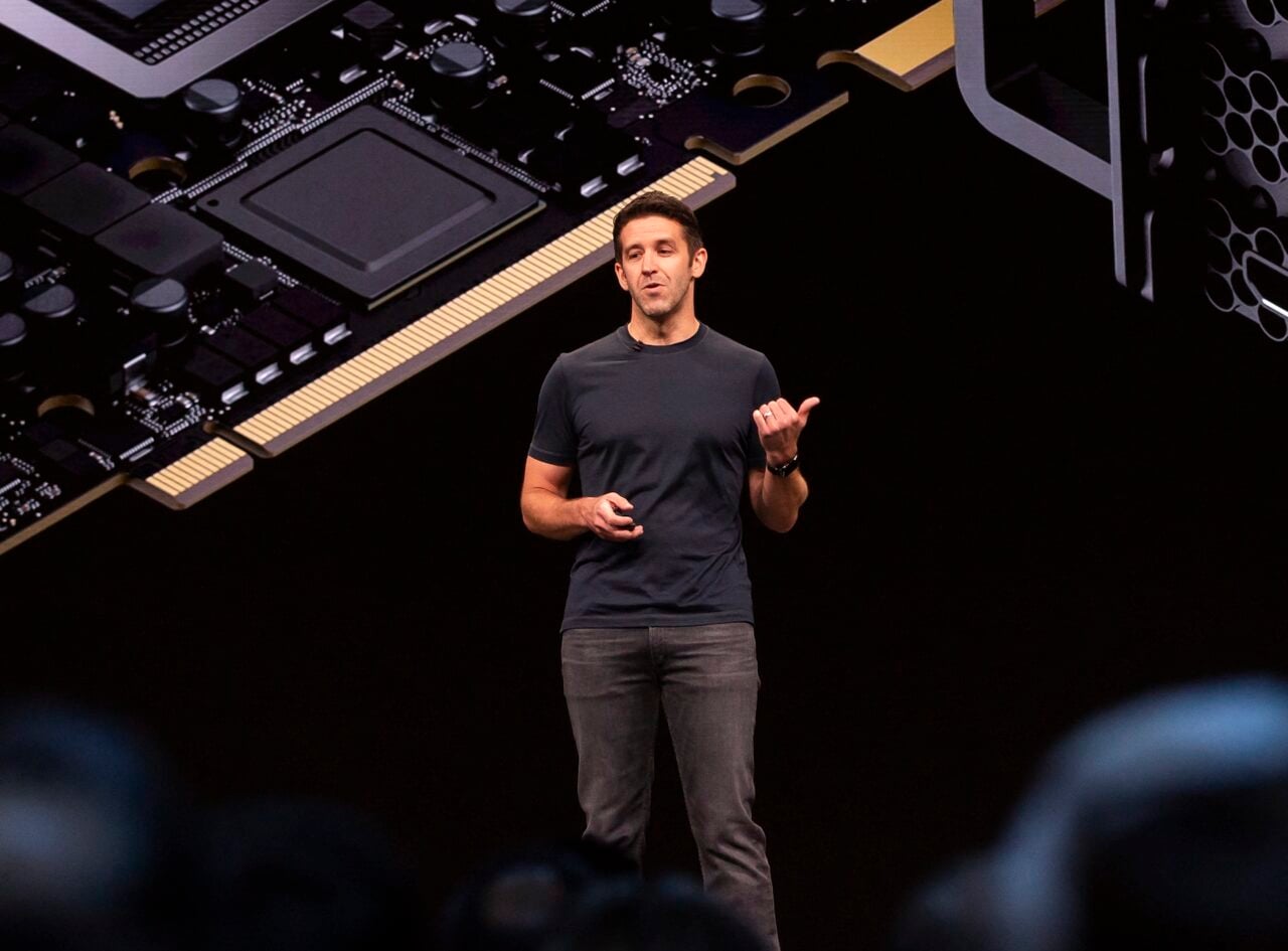
It was one of the more subtle changes showcased during yesterday’s WWDC keynote: Apple finally ditched its OS typeface Lucida Grande to use Helvetica Neue across the board. Now, at least the OS and iOS systems match. But is Helvetica—which is basically unreadable at small sizes—really a better choice?
The slim, unfussy Helvetica Neue is a spot-on pick for the new OS design in several ways: It is clean and uncomplicated, which aligns perfectly with the quest for flatness that pervades the new interface and icons. And it is a typeface that certainly imbues sophistication and timelessness upon its content—it’s a classic font, historically embraced by designers, that has been around for decades. It’s pretty!
https://gizmodo.com/the-future-of-apple-design-is-hidden-inside-os-x-yosemi-1584747896
But when it comes to using it on a computer, especially for type that’s smaller than a headline, designers seem to agree that Helvetica Neue is a poor choice. “It’s just a bad interface typeface,” says Frank Chimero. “Low contrast in letterforms, similar shapes between them, at that. Tough to differentiate at small sizes.”
Legendary type designer Erik Spiekermann probably explains it best with this essay on Helvetica’s problems (bluntly titled “Helvetica sucks”): “It really wasn’t designed for small sizes on screens. Words like milliliter can be very difficult to decipher. If you ever had to read or write a password with 1, i, l, or I, you know the problem.”
Helvetica also wasn’t designed with web functionality in mind. “The use in dropdown menus and buttons doesn’t feel as clear and clickable in Helvetica Neue as it did in Lucida Grande,” says Stuart Sandler. “The same can be said for Twitter’s change to Gotham Narrow which is otherwise a great font but in practice makes Twitter feeds feel less ‘readable’ and more sterile and directional.”
All of this is a pretty big issue, especially when you consider that Helvetica Neue is being used on the teeny tiny screen of a phone. Apple even knows this is a problem because there’s a fix built-in to iOS: You can go into your Accessibility settings and switch to “Bold Text,” which will toggle your type from Helvetica Neue Ultra Light to Helvetica Neue Light.
But why should that even have to be an option? Why not pick one font that works well no matter what the weight?
No one seemed to be missing Lucida Grande, but designers were looking for something better—and less ubiquitous. “I’m glad Apple’s finally as sick of Lucida Grande as I am,” says Scott Anderson. “But Helvetica Neue is equally predictable and disappointing.” This would have never flown under Steve, says Carl Alviani. “Too obvious, too done. Apple used to make a point of doing the next thing and expecting everyone else to catch up.”
Apparently Apple is working on the next thing: A custom in-house typeface called Apple Sans has been in development for years, according to John Gruber. Why it didn’t feel the need to roll it out now is confusing, says Jason Santa Maria. “If Apple is working on their own typeface, perhaps it’s still in development. Feels odd to switch to something so inferior in the meantime.”
Especially when Apple has already designed fonts in-house, it seems like it would be kind of a priority to have a distinctive typeface, designed for screens, that its biggest competitor can’t use.
And while we’re on the subject of screens, sure, type legibility across the board is going to get better with the advances in Retina displays. But until everyone has Retina displays, you’re going to have a lot of squinty, frustrated Apple users. Helvetica is just not fun to read at small sizes—in books, on posters, or on iPads—and it never will be.
I’m thankful for the consistency across operating systems (although I still don’t understand why iOS was rolling out the changes first—is it like beta testing?) and I’ll be happy for the fresh look on my MacBook Air. But to me, this is more evidence of Apple’s ambivalent relationship with type, which is especially surprising compared to the rigor it brings to its industrial design. Jeff Koromi put it this way: “I love how Apple can buy Beats for $3+ billion but hiring a good typographer seems to be beyond them.” Jason Santa Maria agreed: “It’s tough to argue that Apple cares about typography in their software.”
This all makes me a bit nostalgic for my first Mac. Say what you will about Chicago—that typeface was readable as hell.


