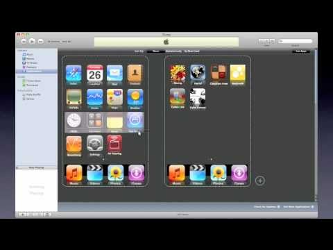
Add, delete, rate, and move—these are your app options on the iPhone. This interface concept, though, puts full app management within iTunes, and makes us wonder why it wasn’t there in the first place.
The concept is simple, and wouldn’t require a change of habit by iPhone/iPod Touch users: in iTunes, users see a representation of their various home screen(s), with which they can remove, move or sort apps. Sorting options are an obvious addition—sorting by most-used is what most people do manually (and imperfectly) anyway, so having a one-click option for that would be an immediate improvement. If custom sorting is your game, this will make the previously cumbersome process almost instant.
Considering how mercilessly quickly people go through their apps, it’s very easy to end up with nonsensically-sorted home screens. Granted, that’s not something we can’t fix already, but this would make life much, much easier. —Thanks, Sean!
https://gizmodo.com/the-life-of-an-iphone-app-nasty-brutish-and-short-5157322