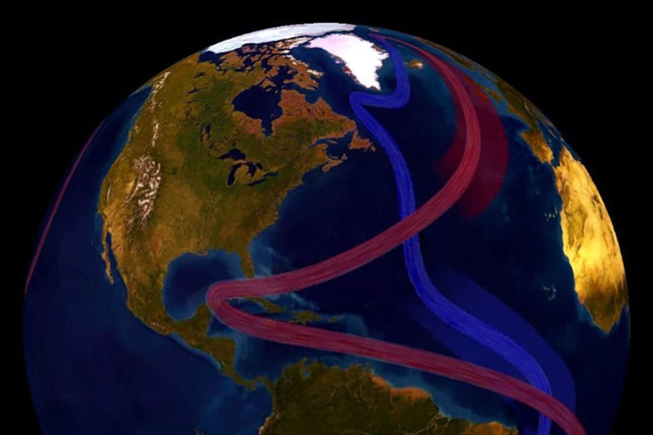
When the the 10th edition of the National Geographic world atlas is released this fall, it will look markedly different from previous versions. That field of endless white usually covering the very north of the planet will be dramatically reduced to reflect the real-life shrinkage of the Arctic ice sheet.
The map will show a loss in “multi-year ice,” defined as ice that has survived for two summers. Since the 1970s, this kind of ice has been slowly disappearing at a rate of about 12 percent per decade, and took a more drastic dive after 2007. For the first time in creating a new edition of the atlas, geographers had to change the graphic representation of the Arctic ice sheet to accurately portray the melted reality. In a video, geographer Juan José Valdés says it’s the biggest visible change in the map since the breakup of the U.S.S.R.
The maps will also now show two different types of ice: the multi-year ice will be shown in white, while the the maximum extent of sea ice—ice that melts and refreezes seasonally—is depicted as a line.
Geographers disagree on how best to represent the current sea ice situation: Namely because it fluctuates so much, of course, but also because the data being pulled for this particular atlas is from 2012, one of the lowest ice years on record. Valdés defends the choice, saying that they are using the best data available. But there’s another good reason to show Arctic ice in this lowest-ever reality: perhaps the change will be so striking from the white mass we remember from our 4th grade social studies class that it will spur some map-readers to take action. [NatGeo]