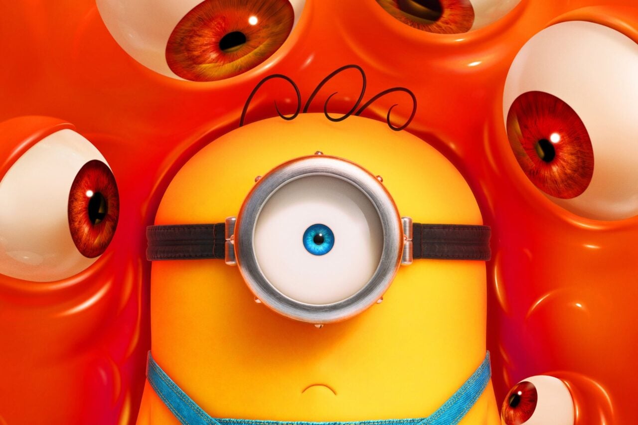
Minion Yellow is a customized shade issued by Pantone with the express purpose of promoting the current installment of a certain film franchise which opened last weekend in theaters nationwide. It’s supposed to make people feel happy. But it makes me feel worried.
Pantone is a system for identifying colors. It is a great tool because it serves as quality control for designers and manufacturers—no matter where or how something is produced, everyone can agree on what the colors should look like for the finished product. In addition to this service, Pantone offers consulting, licensing, forecasting, and, now, advertising for summer blockbusters.
Pantone has become somewhat of a household name—most people probably know it has to do with color—but you’ll know it best because each year they pick the hot color of the upcoming year and attaching some gobbledygook reasons for why the country is trending tangerine over the next 12 months.
Declaring a color of the year is a nice innocent way for Pantone to remain top of mind come each December. It’s fun! We’ve dutifully reported on these colors year after year after year.
But this—creating what they claim to be a brand-new color, brand-named for a cartoon character—is a completely horrible thing for a company that’s all about color to do. Here’s the executive director of Pantone’s Color Institute on Minion Yellow:
“Just as the sun’s rays enliven us, Pantone Minion Yellow is a colour that heightens awareness and creates clarity, lighting the way to the intelligence, originality and the resourcefulness of an open mind — this is the colour of hope, joy and optimism,”
And a much-tweeted response to that statement today:
where is your god now, designers pic.twitter.com/QZMnxk5ygM
— bobby (@bobby) July 14, 2015
The tweet above, as funny as it is, illustrates a crucial problem. Designers can’t live without Pantone. Well, they could, but producing anything would be a disaster. In order to spec colors for products, designers must specify the Pantone number. The Pantone number correlates to more than 10,000 shades which are part of a universal code, the Pantone Matching System, invented in 1963. These numbers tell manufacturers how much of 14 different pigments to add to make the color. These numbers also pretty much dictate the color of every consumer product on Earth (there are some exceptions—the US government has its own proprietary system, for example).
Designers have relied on Pantone for more than 50 years to ensure consistent color across mediums. If you have a big branding project, the color on the logo will be the same as on the packaging, the signage, the uniform. But this requires an investment on the designers’ part. The same company requires designers to buy a Pantone chip book so they can properly compare, choose, and proof colors. But the books fade, so Pantone suggests replacing them annually (of course they do!). Which means designers are shelling out $155 year after year to this company which determines their fate.
(Don’t want the chip book? You can buy a $680 device that can scan a color and assign it the correct Pantone value. But you’ll probably still need the book, too. Want to get access to the newest colors? Buy a $49 piece of software. But you’ll probably still need the book, too.)
When it comes to color, there are some competitors, but for the most part, designers are at the mercy of a single company that controls them all.
T-Mobile took AT&T’s Aio Wireless to court to get the company to change its logo to another type of magenta
And here’s where things start to get sticky. Within the Pantone universe, certain colors have been claimed for commercial interests. Coca-Cola has trademarked its own red (484); T-Mobile has its own magenta (676C), and these companies can sue if they determine another company is using their shade. And they do. In fact, in court, cases cite Pantone’s value system to “claim” colors quite a bit.
So you see what can happen here.
Say you’re a designer and you want to design something uplifting, maybe a quirky character filled with hope, joy, and optimism. You choose a color for the character that’s inspired by the sun’s rays. You choose a color that looks a lot like Minion Yellow. You start to manufacture products for your awesome, uplifting character, which are a huge success.
And you get sued by Universal Pictures and Illumination Entertainment. Pantone has actually made it easier for them to do that.
Pantone wants you to use Minion Yellow—to paint your bedroom. But it definitely just made it a little harder for the design industry to make their own products yellow. And it won’t end there.
Just wait until the partnership with the Avengers franchise, and Disney starts owning colors. Hulk Green. Iron Man Grey. Black Widow. You see where this is going.
According to Pantone this is the first time that a color has ever been exclusively assigned to promote a movie. Please let it be the last. This sets an awful, awful precedent.
Also, blame Pharrell—it was his idea.