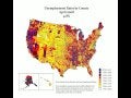
More precisely, this map will be scary for people in the US. It’s a time-lapse video of unemployment rates over two years – the darker the color, the higher the rates. Welcome to the jobless future.
[via LaToya Egwuekwe]
More precisely, this map will be scary for people in the US. It’s a time-lapse video of unemployment rates over two years – the darker the color, the higher the rates. Welcome to the jobless future.
[via LaToya Egwuekwe]
Explore more on these topics
Subscribe and interact with our community, get up to date with our customised Newsletters and much more.